XAML is often criticised for being verbose, hard to read and unnecessary as an additional language for defining the interface for an application. This feedback has lead to the creation of C# markup which works with both Windows UI / Windows App SDK and Uno Platform applications. However, I find that the declarative nature and the separation from the application logic, helps ensure a strong application architecture where the interface is defined in XAML, and any associated logic is kept in the corresponding viewmodels. In order to do this, it’s important to understand the various ways XAML can be optimised and refactored for efficiency and ensure consistency by reusing, rather than redefining, blocks of XAML. In this post we’re going to look at DataTemplates.
In XMAL a DataTemplate is used in order to control the way that a piece of data is displayed. Typically the first place that a new XAML developers will come across is an ItemTemplate in a ListView, where a DataTemplate is used to define how each item in a list is displayed. However, there are other template properties where a DataTemplate can be used. Sticking with a ListView, the HeaderTemplate and FooterTemplate can be used to control how the Header and Footer data are displayed. For example:
<ListView Header="Products">
  <ListView.HeaderTemplate>
    <DataTemplate>
      <TextBlock Text="{Binding}"
                  FontSize="42" />
    </DataTemplate>
  </ListView.HeaderTemplate>
More often than not, the HeaderTemplate property isn’t used, with the XAML instead being added directly to the Header property.
<ListView DataContext="Products">
  <ListView.Header>
      <TextBlock Text="{Binding}"
                  FontSize="42" />
  </ListView.Header>
</ListView>
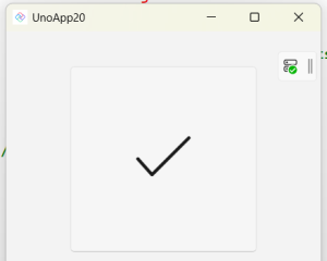
Another example of where a DataTemplate can be used is with a Button. Let’s start with the following XAML that defines a Button with a SymbolIcon inside a ViewBox.
<Button
    Width="200"
    Height="200">
    <Viewbox>
        <SymbolIcon
            Margin="20"
            Symbol="Accept" />
    </Viewbox>
</Button>
This yields a simple icon button where the icon is scaled based on the size of the Button.

Now if we want to resuse this layout but don’t want to go all the way to overriding the Button Style/ControlTemplate, we can move the XAML into a DataTemplate and then set it via the ContentTemplate property.
<StackPanel>
  <StackPanel.Resources>
    <DataTemplate x:Key="IconButtonTemplate">
      <Viewbox>
        <SymbolIcon Margin="20"
                    Symbol="{Binding}" />
      </Viewbox>
    </DataTemplate>
  </StackPanel.Resources>

  <Button Width="200"
          Height="200"
          Content="Accept"
          ContentTemplate="{StaticResource IconButtonTemplate}" />
  <Button Width="200"
          Height="200"
          Content="Cancel"
          ContentTemplate="{StaticResource IconButtonTemplate}" />
</StackPanel>
The Content set on the Button becomes the DataContext inside the DataTemplate, meaning that it will be set as the Symbol property via the Binding expression.
The last way that we’ll cover in this post is where you simply want to reuse blocks of XAML without wanting to attach any additional functionality (such as additional properties, or custom logic and behaviors). For this you can again define a DataTemplate, and use it anywhere in your application using a ContentPresenter.
<ContentPresenter
    Content="Accept"
    ContentTemplate="{StaticResource IconButtonTemplate}" />
Alternatively you can use a ContentControl, which in this scenario delivers the same result. However, the ContentControl class is really designed to be the base class for custom controls, rather than being used explicitly in your application layout. The default ContentTemplate of a ContentControl uses a ContentPresenter in order to display the Content. As such, if all you’re doing is reusing XAML, using the ContentPresenter directly is a simpler approach.
In this post we’ve touched on using DataTemplate for reusing blocks of XAML in your application. If you need to associate logic or behaviour with the XAML you’re reusing, you’ll need to consider building a UserControl or custom control.
1 thought on “XAML Reuse with Templates in Applications for Windows and the Uno Platform”