Last week, the Uno Platform officially launched their Figma Plugin which works in parity with the Uno Platform Material Toolkit to support both designers and developers with the process of designing applications. If you haven’t already, check out the announcement post that provides a high level overview of both the plugin and toolkit. In this post we’ll dig deeper into both so you can understand why you might want to use these tools for building either a Windows or a cross platform Uno Application.
Uno Platform Material Toolkit
Whilst a lot of the magic of Figma tooling offered by the Uno Platform comes via the plugin, for example the generation of XAML and C# Markup that can be exported, the value of the Material Toolkit shouldn’t be underestimated. The Uno Platform Material Toolkit isn’t alone in the Figma community when it comes to design files that provide a starting point for designing applications that use the Material design language. However, what differentiates it, is that the implementation of Material styles has been done in a way that XAML and C# Markup can be generated that is compatible with WinUI and the Uno Platform. The point is, if you’re looking to use Figma to design a Windows or Uno Platform application, you should start with the Uno Platform Material Toolkit.
Example App
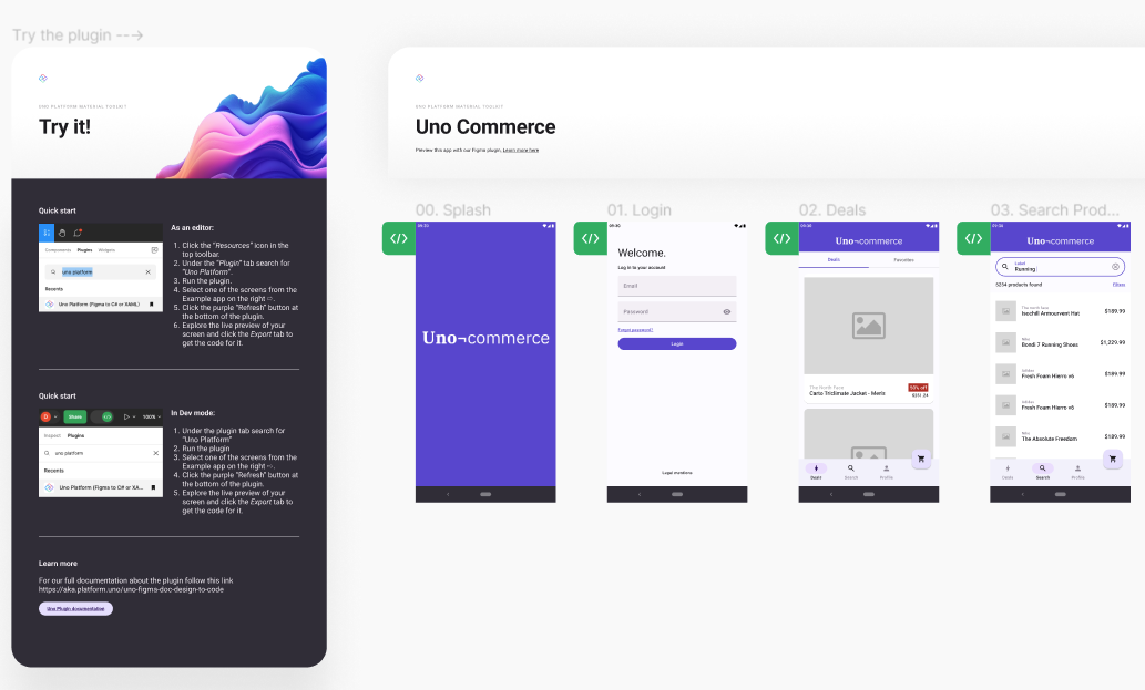
The first page in the Uno Platform Material Toolkit in an Example App that shows a number of sample pages of a retail application. This is similiar to the Commerce sample application that you can find in the Uno.Samples repository.
On the left, you can follow the instructions to install the Uno Platform Figma Plugin, which we’ll cover in more detail a bit later. If you make changes to the theme/styles, you can return to the Example App and see how the changes are applied.
Getting Started
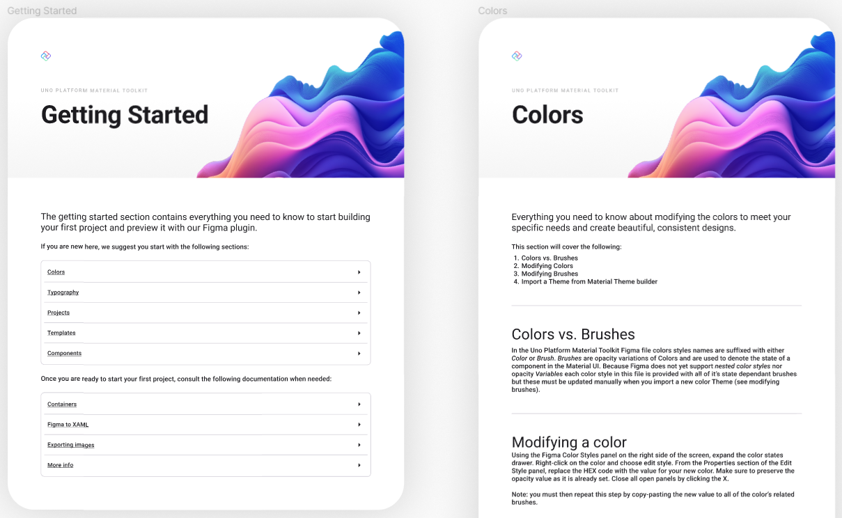
On the Getting Started page you can read through the guidance on how to get the most out of the Uno Platform Material Toolkit. Take the time to read each section and try out things like modifying colors or trying out different fonts.
Themes
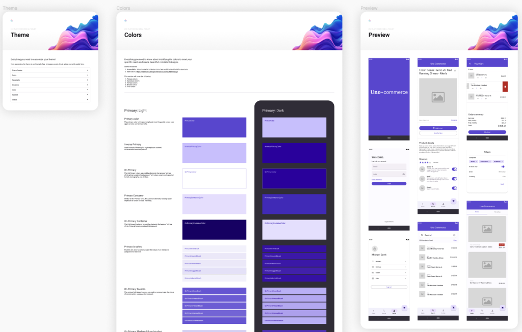
To make changes to the theme used in the Uno Platform Material Toolkit open the Themes page which shows the colors, typography, elevations, icons, app icons and images. These can be accessed individually from the appropriate section, or you can see them in the context on the Preview section.
Components
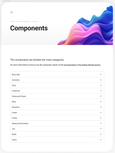
The Components page include the standard controls, such as Button and TextBlock, that are used to make up most applications. From the index page, you can quickly jump to the appropriate section for the control your interested in.
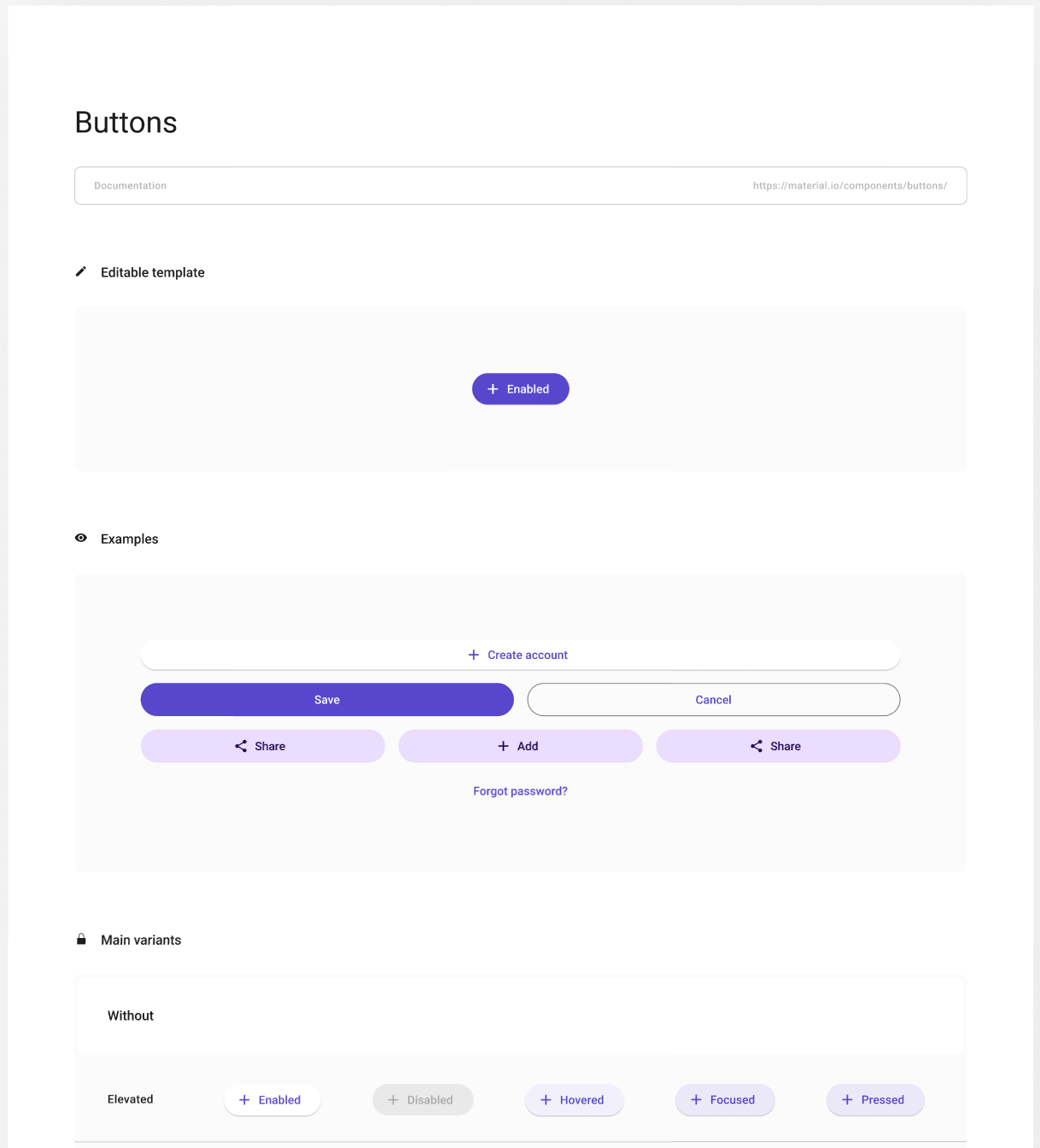
As you can see from the Button section shown in the above image, each section not only shows the control, it also shows all the variants for the control.
Templates
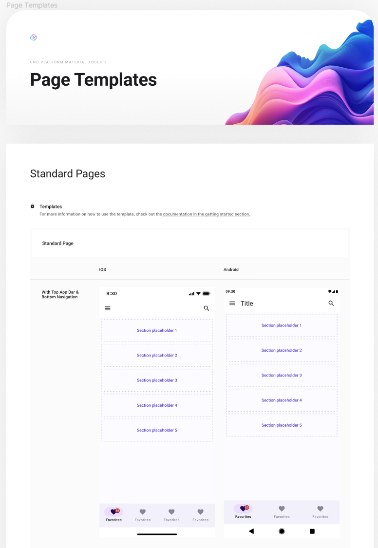
The Templates page provides high level templates for Pages, Cards, Forms, Lists and more.
Other Pages
The remaining pages in the Uno Platform Material Toolkit include the Cover, a Changelog, Feedback and Credits.
Uno Platform Figma to C# or XAML Plugin
The Uno Platform Figma Plugin is a contextually aware plugin that’s used to preview and export either C# or XAML from a Figma file derived from the Uno Platform Material Toolkit. By this I mean that as you change the selected page and layer you can preview and export the current selection.
Preview
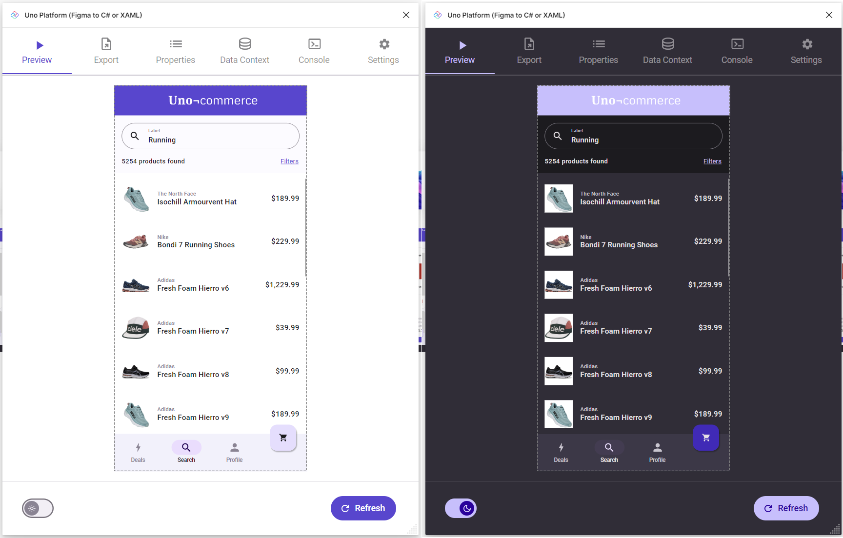
The first tab in the plugin is the Preview tab where you can see how the currently selected application page will appear when it’s running inside an Uno Platform application. Because the Figma Plugin is an Uno Platform application running in WASM, the Figma design is exported to XAML and which is then parsed and displayed within the application – this makes the preview as close as possible to what you would see if you exported the design into a separate Uno Platform application.
The Preview tab also supports switching between Dark and Light themes, as shown in the image above.
Export
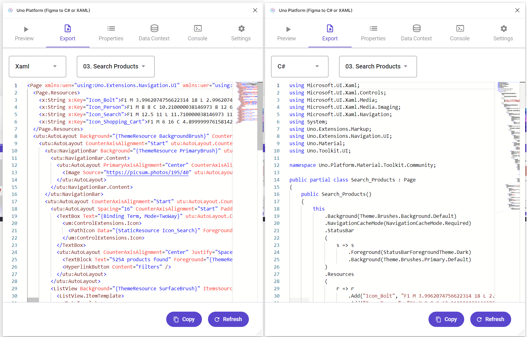
The Export tab allows for generation of XAML or C# Markup that can be copied into an Uno Platform application (which includes any Windows application built with WinUI and the Windows App SDK).
Properties
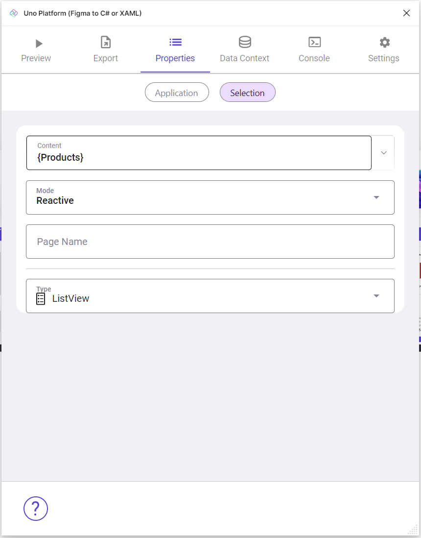
From the Properies tab it’s possible to set data binding and other page specific properties. The Application properties can be used to set the namespace used when exporting code.
Data Context
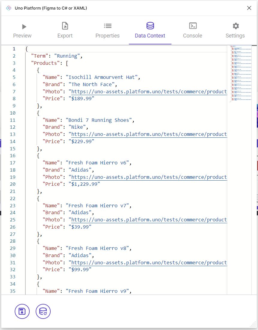
In order for the Preview tab to show a meaning full representation of the design, it’s useful to specify design time data in JSON via the Data Context tab. You can see in this image an array of items with a Key of Products. In the earlier image of the properties, you can see a data binding expression of Products – this is how the preview shows a list of products.
Console
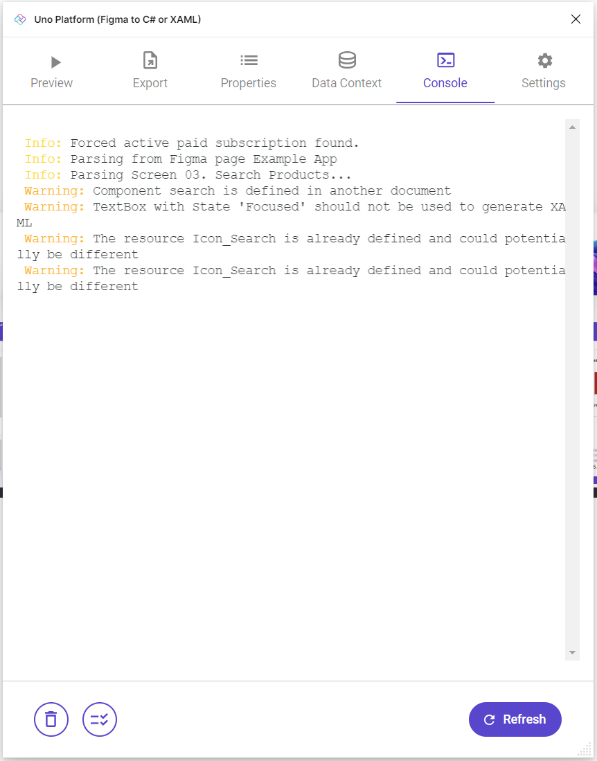
If the Preview or Export tab isn’t working, it may be necessary to check out the Console to see if there are any errors.
Settings
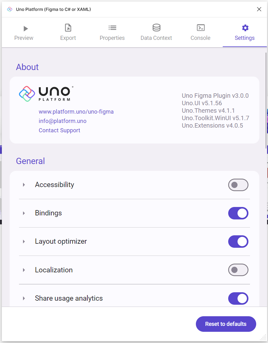
The Settings tab can be used to adjust aspects of the behavior of the plugin. For example, toggling the Binding setting will control whether binding expressions are exported in the XAML or C# Markup.
Summary
In this post we’ve covered the main screens/tabs of the Uno Platform Material Tookit and the Uno Platform Figma Plugin. Hopefully this will provide you the basis to take a look at these tools and see how you can use them to help you design and build applications for Windows and other platforms using the Uno Platform.
1 thought on “Designing and Building Windows Applications using Figma and the Uno Platform”