One of the things that sets WinUI apart from other UI frameworks is that provides a declarative way to define visual states for a control or a page. It also allows for the transitions between states to be defined. In this post we’re going to cover how to define both transitions and state animations and how they’re related. We’ll conclude with looking at how performance settings in Windows affect whether transitions and animations run.
Ok, so to get started, let’s start by creating a simple app and add a basic layout to the page. We’re going to create the app using the Uno Platform solution template, since everything we cover in the post will work across all targets supported by the Uno Platform.
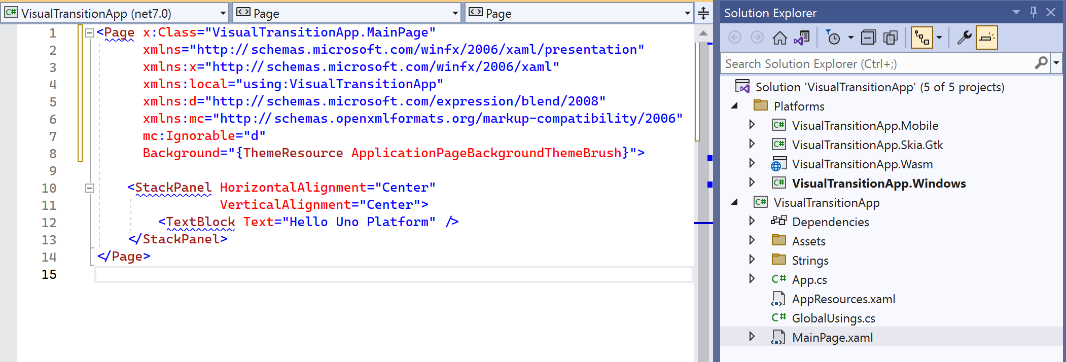
We’ll switch out the existing StackPanel for a Grid that contains a green and blue Borders. We’ll include a couple of Buttons that will be used to toggle the visibility of the two Borders.
<Grid>
	<Grid.RowDefinitions>
		<RowDefinition />
		<RowDefinition Height="Auto" />
	</Grid.RowDefinitions>
	<Border x:Name="GreenBorder"
			Background="Green" />
	<Border x:Name="BlueBorder"
			Background="Blue" />
	<StackPanel Grid.Row="1"
				HorizontalAlignment="Center"
				Orientation="Horizontal">
		<Button Content="Green"
				Click="GreenClick" />
		<Button Content="Blue"
				Click="BlueClick" />
	</StackPanel>
</Grid>
And the code to switch the visibility:
private void GreenClick(object sender, RoutedEventArgs e)
{
    GreenBorder.Visibility = Visibility.Visible;
    BlueBorder.Visibility = Visibility.Collapsed;
}
private void BlueClick(object sender, RoutedEventArgs e)
{
    GreenBorder.Visibility = Visibility.Collapsed;
    BlueBorder.Visibility = Visibility.Visible;
}
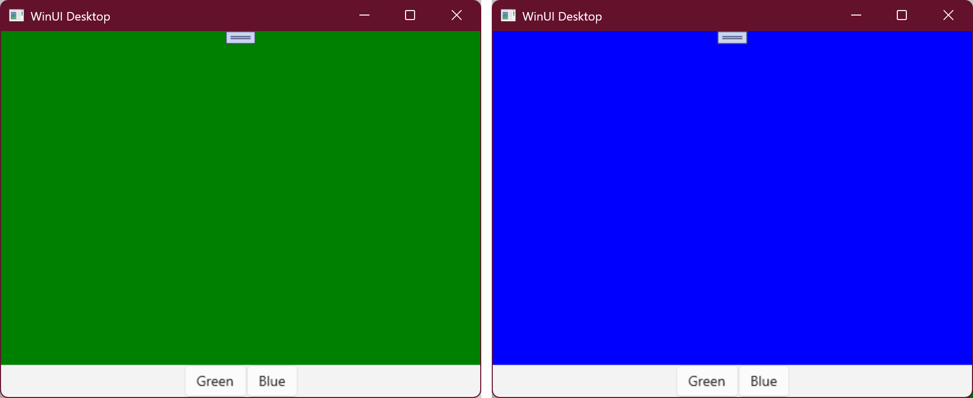
And when the application is run, clicking the buttons switches the background color from Green to Blue.
Visual States
Whilst this code works, as the complexity of the code grows, this is likely to become harder to manage. A better approach is to define two visual states, Green and Blue, that show and hide the GreenBorder and BlueBorder respectively. It’s a bit more XAML but it makes it clearer what changes with each VisualState.
<Grid>
	<VisualStateManager.VisualStateGroups>
		<VisualStateGroup>
			<VisualState x:Name="Green">
				<VisualState.Setters>
					<Setter Target="GreenBorder.Visibility"
							Value="Visible" />
				</VisualState.Setters>
			</VisualState>
			<VisualState x:Name="Blue">
				<VisualState.Setters>
					<Setter Target="BlueBorder.Visibility"
							Value="Visible" />
				</VisualState.Setters>
			</VisualState>
		</VisualStateGroup>
	</VisualStateManager.VisualStateGroups>
	<Grid.RowDefinitions>
		<RowDefinition />
		<RowDefinition Height="Auto" />
	</Grid.RowDefinitions>
	<Border x:Name="GreenBorder"
			Background="Green"
			Visibility="Collapsed" />
	<Border x:Name="BlueBorder"
			Background="Blue"
			Visibility="Collapsed" />
	<StackPanel Grid.Row="1"
				HorizontalAlignment="Center"
				Orientation="Horizontal">
		<Button Content="Green"
				Click="GreenClick" />
		<Button Content="Blue"
				Click="BlueClick" />
	</StackPanel>
</Grid>
And the code to switch states is:
private void GreenClick(object sender, RoutedEventArgs e)
{
    VisualStateManager.GoToState(this, nameof(Green), true);
}
private void BlueClick(object sender, RoutedEventArgs e)
{
    VisualStateManager.GoToState(this, nameof(Blue), true);
}
State Animations
When the buttons are pressed to switch visual state, the transition happens in an instant, which can be a little jarring. In order to improve the user experience, we can animation the transition to hide and show the green and blue Border elements. The code currently uses the Visibility property to control whether the elements are shown or not. Binary, or Enumeration, values can’t be animated, so in order for us to animate this transition we need to switch to using the Opacity property.
Rather than use Setters to define what the Opacity should be in each state, we’re going to use a Storyboard to define the animation that should play for each visual state. In the following code, each storyboard defines two DoubleAnimationUsingKeyFrames, for the Opacity of the GreenBorder and BlueBorder respectively.
<Page.Resources>
	<x:String x:Key="TransitionAnimationDuration">00:00:05.000</x:String>
</Page.Resources>
<Grid>
	<VisualStateManager.VisualStateGroups>
		<VisualStateGroup>
			<VisualState x:Name="Green">
				<Storyboard>
					<DoubleAnimationUsingKeyFrames Storyboard.TargetName="GreenBorder"
													Storyboard.TargetProperty="Opacity">
						<LinearDoubleKeyFrame KeyTime="{StaticResource TransitionAnimationDuration}"
												Value="1" />
					</DoubleAnimationUsingKeyFrames>
					<DoubleAnimationUsingKeyFrames Storyboard.TargetName="BlueBorder"
													Storyboard.TargetProperty="Opacity">
						<LinearDoubleKeyFrame KeyTime="{StaticResource TransitionAnimationDuration}"
												Value="0" />
					</DoubleAnimationUsingKeyFrames>
				</Storyboard>
			</VisualState>
			<VisualState x:Name="Blue">
				<Storyboard>
					<DoubleAnimationUsingKeyFrames Storyboard.TargetName="BlueBorder"
													Storyboard.TargetProperty="Opacity">
						<LinearDoubleKeyFrame KeyTime="{StaticResource TransitionAnimationDuration}"
												Value="1" />
					</DoubleAnimationUsingKeyFrames>
					<DoubleAnimationUsingKeyFrames Storyboard.TargetName="GreenBorder"
													Storyboard.TargetProperty="Opacity">
						<LinearDoubleKeyFrame KeyTime="{StaticResource TransitionAnimationDuration}"
												Value="0" />
					</DoubleAnimationUsingKeyFrames>
				</Storyboard>
			</VisualState>
		</VisualStateGroup>
	</VisualStateManager.VisualStateGroups>
	<Grid.RowDefinitions>
		<RowDefinition />
		<RowDefinition Height="Auto" />
	</Grid.RowDefinitions>
	<Border x:Name="GreenBorder"
			Background="Green"
			Opacity="0" />
	<Border x:Name="BlueBorder"
			Background="Blue"
			Opacity="0" />
	<StackPanel Grid.Row="1"
				HorizontalAlignment="Center"
				Orientation="Horizontal">
		<Button Content="Green"
				Click="GreenClick" />
		<Button Content="Blue"
				Click="BlueClick" />
	</StackPanel>
</Grid>
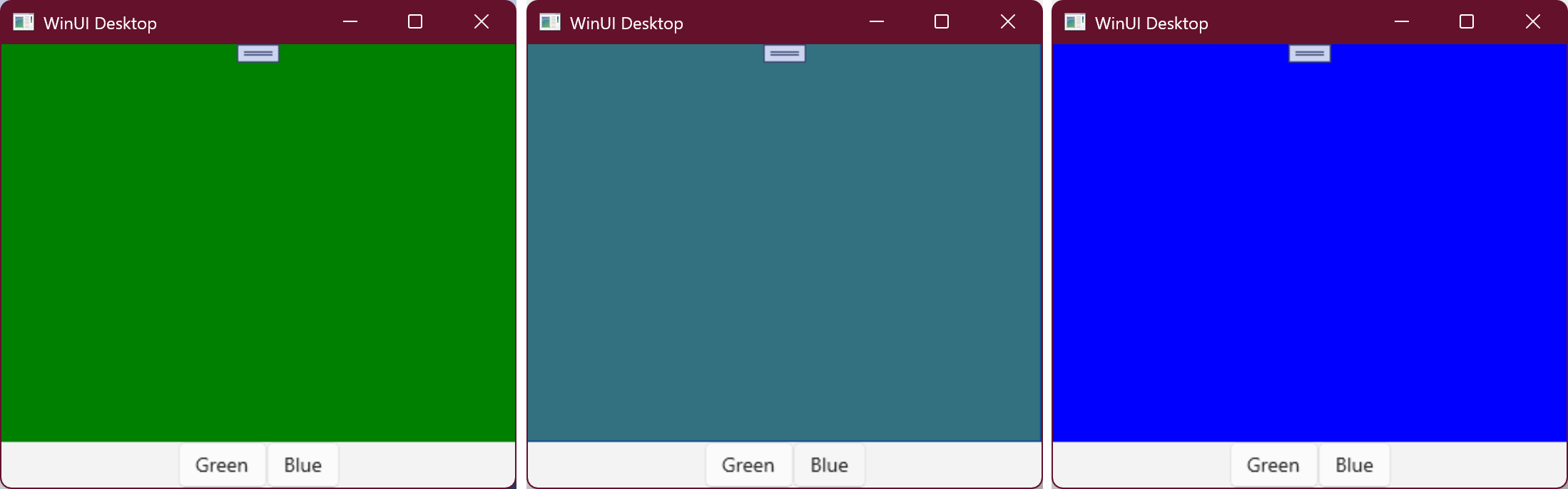
One thing to note about the animations is that they only define the end value for each property. Whilst you could specify the start value, what you would see is a jump from whatever the current Opacity is, to the start value. For example if you were to quickly toggle between Green and Blue states, without allowing enough time for the animation to run, the value of the Opacity wouldn’t be 1 or 0 when the animation starts. If you define a start value, the Opacity will be immediately set to that value and then the animation will commence. It’s better to omit the start value, and let the animation framework use the current value as the starting point.
When we run this, and toggle the buttons, we’ll see a gradual transition over 5 seconds (the TransitionAnimationDuration resource value) between the two visual states.
VisualTransition
The way we have currently define the animation change between the visual states is acceptable. However, there are a couple of limitations to using state animations, the main one being that they will always run, and there are at least two scenarios where animations shouldn’t be run. At this point we’ll cover the first but we’ll return at the end of the post to discuss the second scenario.
The first scenario where you don’t want animations to run is any time you invoke the VisualStateManager.GoToState method and pass in false to the useTransitions parameter (the third parameter). This may because you want to set the initial state of a control/page, or perhaps you want to quickly switch to a state, without a delay. Regardless of the reason, if you’re using state animations, like we’ve just defined, they’ll run irrespective of the useTransitions value.
The alternative is to use a VisualTransition that defines the transition (aka animation) that will take place when switching states. Note that we have to define two transitions that go from Green to Blue and Blue to Green states.
<VisualStateManager.VisualStateGroups>
	<VisualStateGroup>
			<VisualStateGroup.Transitions>
				<VisualTransition From="Green"
									To="Blue">
					<Storyboard>
						<DoubleAnimationUsingKeyFrames Storyboard.TargetName="BlueBorder"
														Storyboard.TargetProperty="Opacity">
							<LinearDoubleKeyFrame KeyTime="{StaticResource TransitionAnimationDuration}"
													Value="1" />
						</DoubleAnimationUsingKeyFrames>
						<DoubleAnimationUsingKeyFrames Storyboard.TargetName="GreenBorder"
														Storyboard.TargetProperty="Opacity">
							<LinearDoubleKeyFrame KeyTime="{StaticResource TransitionAnimationDuration}"
													Value="0" />
						</DoubleAnimationUsingKeyFrames>
					</Storyboard>
				</VisualTransition>
				<VisualTransition From="Blue"
									To="Green">
					<Storyboard>
						<DoubleAnimationUsingKeyFrames Storyboard.TargetName="GreenBorder"
														Storyboard.TargetProperty="Opacity">
							<LinearDoubleKeyFrame KeyTime="{StaticResource TransitionAnimationDuration}"
													Value="1" />
						</DoubleAnimationUsingKeyFrames>
						<DoubleAnimationUsingKeyFrames Storyboard.TargetName="BlueBorder"
														Storyboard.TargetProperty="Opacity">
							<LinearDoubleKeyFrame KeyTime="{StaticResource TransitionAnimationDuration}"
													Value="0" />
						</DoubleAnimationUsingKeyFrames>
					</Storyboard>
				</VisualTransition>
			</VisualStateGroup.Transitions>
		<VisualState x:Name="Green">
				<VisualState.Setters>
					<Setter Target="GreenBorder.Opacity"
							Value="1" />
				</VisualState.Setters>
		</VisualState>
		<VisualState x:Name="Blue">
				<VisualState.Setters>
					<Setter Target="BlueBorder.Opacity"
							Value="1" />
				</VisualState.Setters>
			</VisualState>
	</VisualStateGroup>
</VisualStateManager.VisualStateGroups>
We also need to make sure we set the final Opacity value in the Setters, otherwise after the VisualTransition has completed, it will revert back to the original Opacity values (which is 0 for both BlueBorder and GreenBorder).
When we run this code, it’ll be exactly the same as the state animation implementation. However, if we change the useTransition parameter to false, you’ll see that the state transitions happens without animating the Opacity.
You’ll actually notice that there’s one additional difference. The first time you click on a Button, the transition to that state will happen immediately, which was not the case with state animations. There’s two ways to address this. The first is that you could define an additional transition for both Blue and Green states where you omit the From value (in otherwords a transition from “undefined” to either Green or Blue states). Alternatively you can just use GoToState with useTransition set the initial VisualState.
public MainPage()
{
    this.InitializeComponent();
    VisualStateManager.GoToState(this, nameof(Green), false);
}
Performance
I mentioned there was a second scenario where you would want to define VisualTransitions instead of state animations, and that’s to take advantage of the integration between WinUI and the Windows platform. If you type Performance into the State Menu, you can click on the “Adjust the appearance and performance of windows” item.
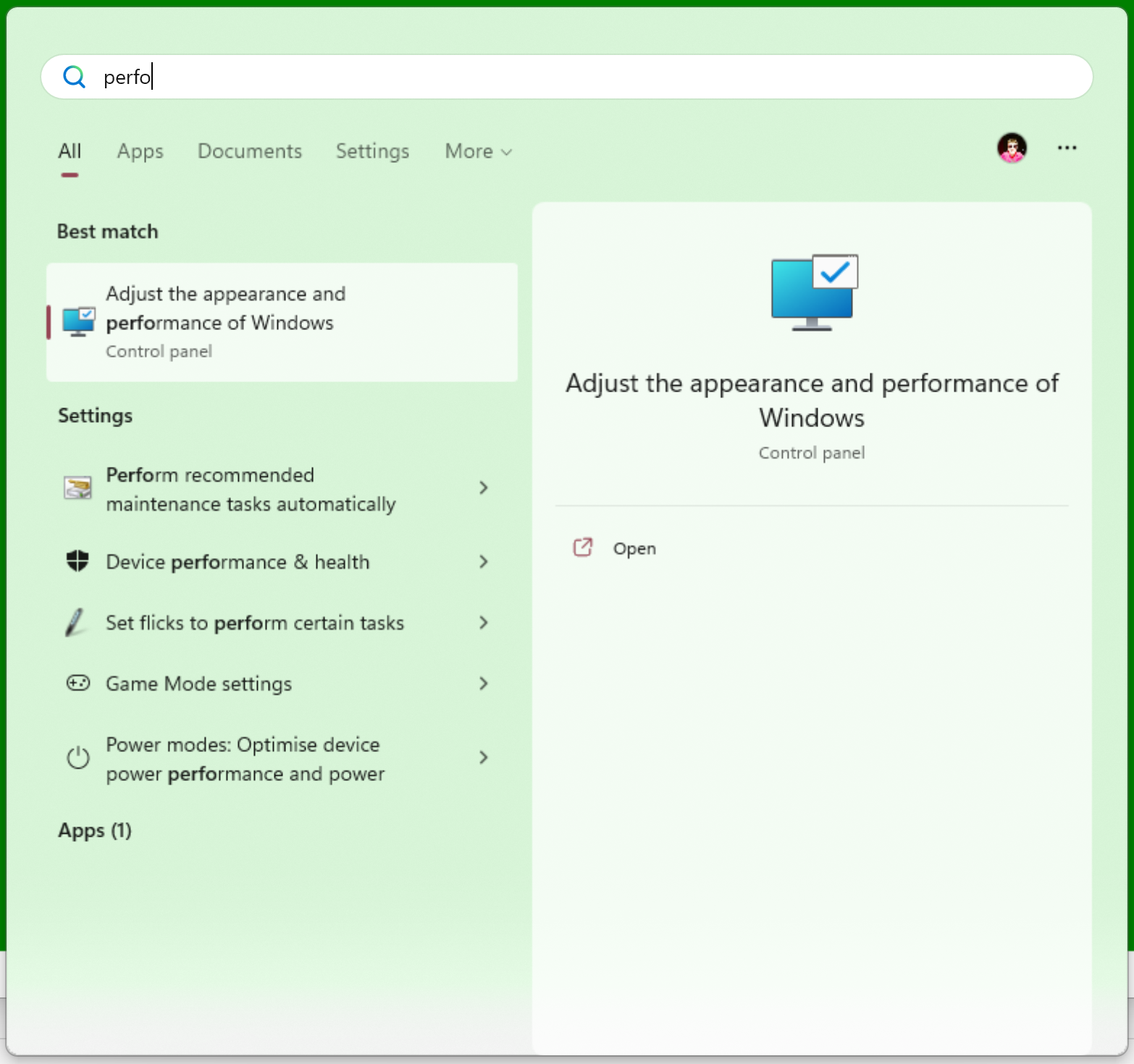
This will open up the Performance Options where you can customize how Windows prioritise appearance versus performance. Most users are unlikely to have ever found this dialog, so it will be set to the default “Let windows choose what’s best for my computer”.
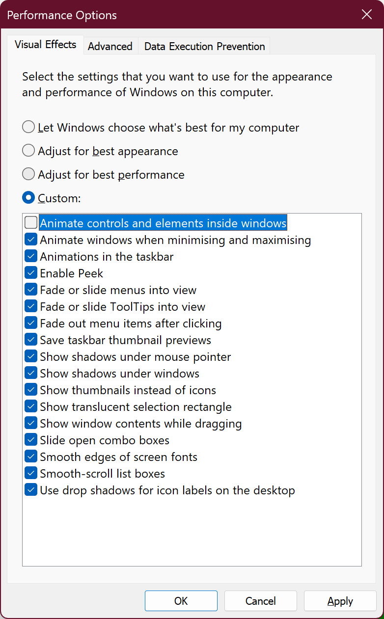
What this means is that in some cases, Windows may decide to adjust the settings to improve performance. In the above image I’ve unchecked the first option, to “Animate controls and elements inside Windows”. The effect of this option is to prevent VisualTransitions from running.
You might think that preventing VisualTransitions from running is a bad thing, but if you think of the scenarios where Windows might invoke this, it’s actually a really clever thing to do. For example, if the device is running low on power, or the user is connecting via remote desktop, it’s very useful to conserve power by limiting the use of animations.
Anyhow, hopefully in this post you’ve seen how to use both state animations and VisualTransitions in order to animate between VisualStates. Hopefully this helps you determine the best way to implement the states of your application.
Great work. Much appreciate the clear and concise explanation.
I have used similar XAML in WPF. It works well and as long as we don’t over complicate the scenarios then it’s also easy to understand and maintain.
This is a very useful article. Its end was especially interesting.