One of the most significant aspects of the XAML based applications is the concept of lookless controls. I’ve covered this topic a bit in the past but in summary it means that controls can be restyled without changing the behaviour. The Windows App SDK and the Uno Platform provide out of the box styles for GridView and ListView controls which provide a great starting point for working with these controls. In this post we’re going to dig into these styles to show how to implement a feature that’s a little out of the ordinary, being able to disable individual items.
The default style for these controls includes a Disabled state, which is applied to each of the items when the IsEnabled property on the control is set to true. In some scenerios it may be necessary to disable individual items. Unfortunately, unlike a lot of other aspects of the GridView and ListView controls, there’s no easy way to disable individual items. Let’s dig into this and look at why it’s difficult and a workaround that can be used. For the rest of this post we’re going to focus on the GridView but everything we cover can be applied equally to the ListView control.
Disabling Items via IsEnabled on GridViewItem
The GridView control has a number of templates that controls how the control is styled. There is a ControlTemplate for the GridView that defines things like the position and style of scrollbars. The arrangement of items is govered by the the ItemsPanelTemplate (the ItemsPanel property). The layout of each item is controlled by the ItemTemplate. Each item is wrapped in a GridViewItem, and it’s the ControlTemplate for the GridViewItem that defines the various visual states for the item, such as Selected, Pressed and Disabled.
When the GridView is disabled, the each of the GridViewItem transitions to the Disabled visual state. In order to disable an individual item, the challenge is to switch the respective GridViewItem into the Disabled state. This requires accessing the GridViewItem in order to set the IsEnabled property to false.
Accessing the GridViewItem isn’t straightforward since the lifecycle of each GridViewItem is managed by the GridView. However, there is a point where we can access the GridViewItem, which is at the point where it’s applying the ItemTemplate for the corresponding item that’s to appear in the GridView. At this point the GridViewItem is already created and it’s template has been applied. Normally, an instance of the ItemTemplate is created (or recycled) and is used to layout the item. However, if we use an ItemTemplateSelector, we have an opportunity to interact with the GridViewItem before it applies the ItemTemplate.
In the following code, the CustomTemplateSelector is used to setup a Binding between the IsEnabled property on the GridViewItem (actually on SelectorItem which is the base for GridViewItem and ListViewItem) and the IsEnabled property on the item being displayed.
public class CustomTemplateSelector : DataTemplateSelector
{
    public DataTemplate ItemTemplate { get; set; }

    protected override DataTemplate SelectTemplateCore(object item, DependencyObject container)
    {
        if(container is SelectorItem selector &&
            item is SimpleItem si)
        {
            var myBinding = new Binding
            {
                Source = si,
                Path = new PropertyPath(nameof(si.IsEnabled)),
                Mode = BindingMode.TwoWay,
                UpdateSourceTrigger = UpdateSourceTrigger.PropertyChanged
            };
            BindingOperations.SetBinding(selector, SelectorItem.IsEnabledProperty, myBinding);
        }
        return ItemTemplate;
    }
}
In XAML we need to create an instance of the CustomTemplateSelector and set the ItemTemplate to be the layout for the item to be displayed.
<local:CustomTemplateSelector x:Key="CustomTemplateSelector">
	<local:CustomTemplateSelector.ItemTemplate>
		<DataTemplate>
			<Grid Height="200"
				Width="200">
				<TextBlock Text="{Binding Display}"
						HorizontalAlignment="Center"
						VerticalAlignment="Center" />
			</Grid>
		</DataTemplate>
	</local:CustomTemplateSelector.ItemTemplate>
</local:CustomTemplateSelector>
And then we apply the CustomTemplateSelector to the GridView.
<GridView ItemsSource="{x:Bind Items}"
			ItemTemplateSelector="{StaticResource CustomTemplateSelector}">
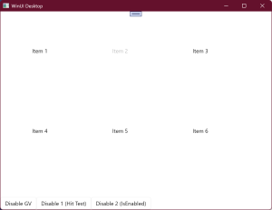
Now items in the GridView can be disabled by adjusting the IsEnabled property on the item. The following image shows Item 2 in the disabled state.

Disabling Items using IsHitTestEnabled
An alternative to using the existing Disabled state in the Template for the GridViewItem, is to set the IsHitTestEnabled property to false for the relevant GridViewItem. This effectively disables the item by preventing input on the disabled item from being processed by the GridView
This can be done in XAML by data binding the IsHitTestEnabled property on the root element of the Template for the GridViewItem to the IsEnabled property on the relevant item.
<Style x:Key="CustomDefaultGridViewItemStyle"
		TargetType="GridViewItem">
	.... setters ...
	<Setter Property="Template">
		<Setter.Value>
			<ControlTemplate TargetType="GridViewItem">
				<ListViewItemPresenter x:Name="Root"
				    IsHitTestVisible="{Binding IsEnabled}"
				    .. properties ...
				    />
			</ControlTemplate>
		</Setter.Value>
	</Setter>
</Style>
Note that because this option doesn’t use the Disabled state, you’ll need to update the layout for the item in the ItemTemplate to reflect that the item is disabled. For example, in the following XAML, a gray Border is displayed when the IsEnabled property is false (note the use of an inverted bool to visibility converter).
<DataTemplate x:Key="CustomItemTemplate">
	<Grid Height="200"
			Width="200">
		<Border	Background="Gray"
				Visibility="{Binding IsEnabled, Converter={StaticResource BoolVisibilityConverter}, ConverterParameter=invert}" />
		<TextBlock Text="{Binding Display}"
					HorizontalAlignment="Center"
					VerticalAlignment="Center" />
	</Grid>
</DataTemplate>
In this post we’ve cover two ways that you can disable individual items in the GridView. The benefits of using the template selector approach is that it makes use of the existing Disabled visual state and the template selector can be reused across any GridView or ListView.
As a side note about the Uno Platform: If you’re planning to take this strategy cross platform with the Uno Platform you’ll notice that the container parameter in the SelectTemplateCore method of the DataTemplateSelector isn’t a SelectItem. Instead it’s a ContentPresenter and you then need to access the TemplatedParent property in order to get the GridViewItem.
1 thought on “How to Disable Individual GridView and ListView Items in a XAML Application (WinUI + Uno Platform)”