In the previous posts on building Widgets for Windows 11 (Getting Started and Adding to UWP) the design for the widget was defined in a json file that defines the contents and layout of the widget. In this post we’ll take a look at adaptivecards.io, a web-based designer that you can use to design and test the layout of your widget.
AdaptiveCards.IO
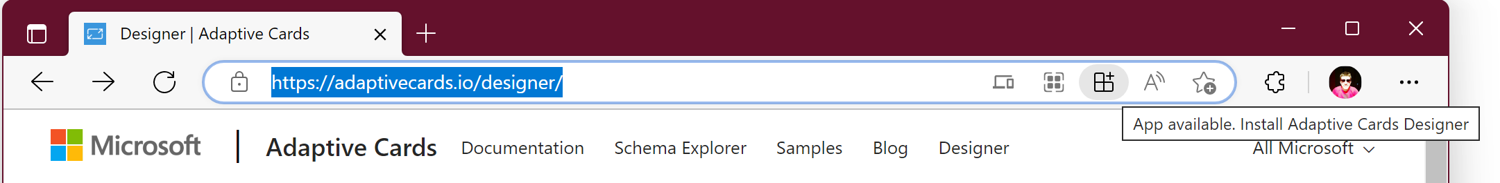
To get started, head over to adaptivecards.io and click the Get Started button

Next, click the Open Card Designer button in the top right corner of the site.
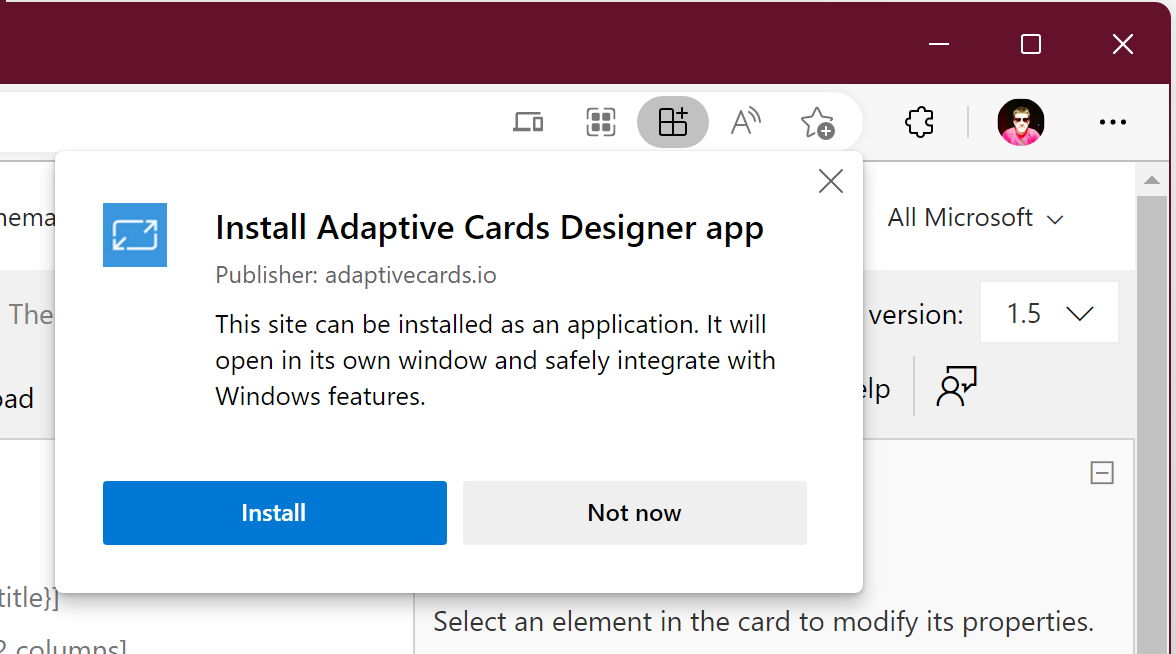
Once the designer is open, you can opt to install the site as an app using the appropriate button adjacent to the address bar.
You’ll need to click the Install button, which will install the website as an application.
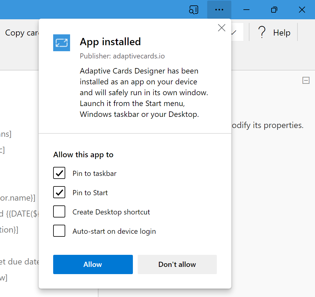
After installing, if you’re using Edge, you’ll also see a prompt suggesting further Windows integration, such as pinning the application to the Taskbar – this is useful if you’re going to be frequently using the deisgn tool as it makes it easier to launch the application when you need it.
Getting Started
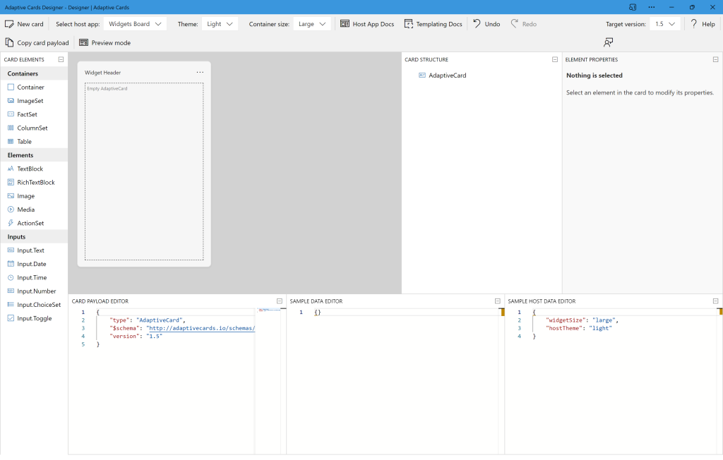
The first thing you’ll want to do in the adaptivecards.io designer is to change the host app dropbox to ‘Widget Board’.

I would also recommend changing the Target version dropbox to version 1.5, which will remove the validation warning message at the bottom of the visual designer.

Creating a new Widget
To creat a new widget layout, click the New card button in the top left of the adaptivecards.io site. This will open a dialog that allow you to Create (either a Blank card or a card from a Json Schema) or Explore some existing card templates.
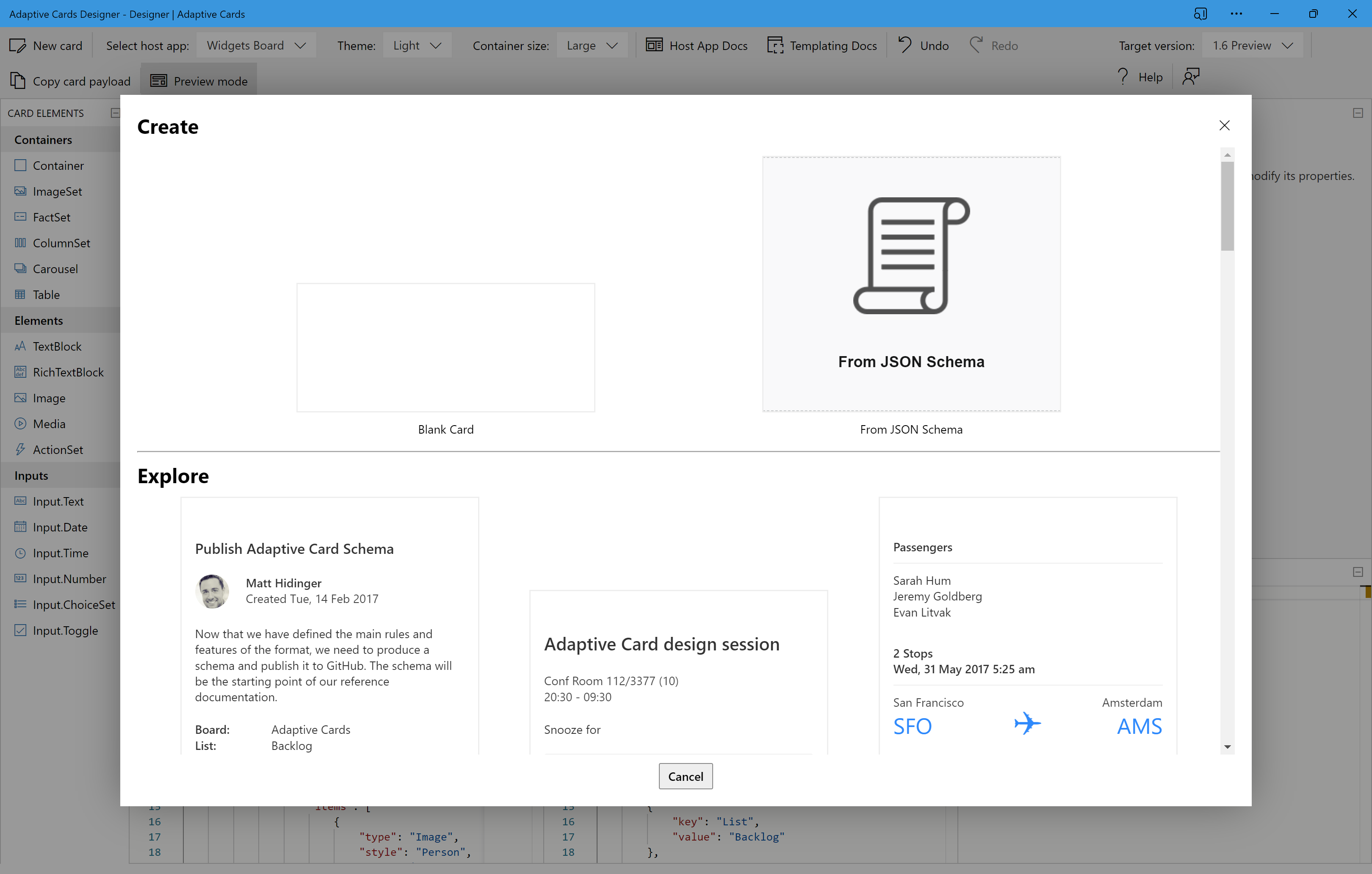
I would recommend browsing some of the card templates in the Explore section as it gives you an idea of the types of widget layouts you might want to use.
For now, we’ll select the Blank Card option
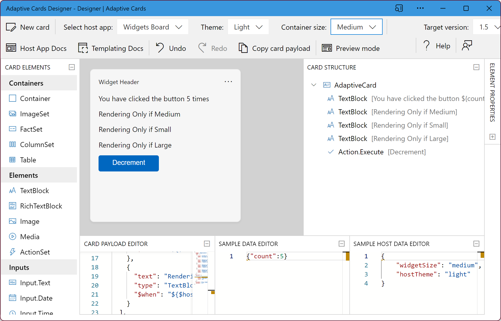
In the Card Payload Editor area in the lower region of the adaptivecards.io site we’ll paste the contents of the json file that we used in the previous posts.
{
  "type": "AdaptiveCard",
  "body": [
    {
      "type": "TextBlock",
      "text": "You have clicked the button ${count} times"
    },
    {
      "text": "Rendering Only if Medium",
      "type": "TextBlock",
      "$when": "${$host.widgetSize==\"medium\"}"
    },
    {
      "text": "Rendering Only if Small",
      "type": "TextBlock",
      "$when": "${$host.widgetSize==\"small\"}"
    },
    {
      "text": "Rendering Only if Large",
      "type": "TextBlock",
      "$when": "${$host.widgetSize==\"large\"}"
    }
  ],
  "actions": [
    {
      "type": "Action.Execute",
      "title": "Decrement",
      "verb": "dec"
    }
  ],
  "$schema": "http://adaptivecards.io/schemas/adaptive-card.json",
  "version": "1.5"
}
We’ll also add the following json to the Sample Data Editor
{
  "count": 5
}
This will update the design area to show the layout of the widget in design mode. As you can see it shows all four of the text elements, despite the Container size dropdown being set to Medium.
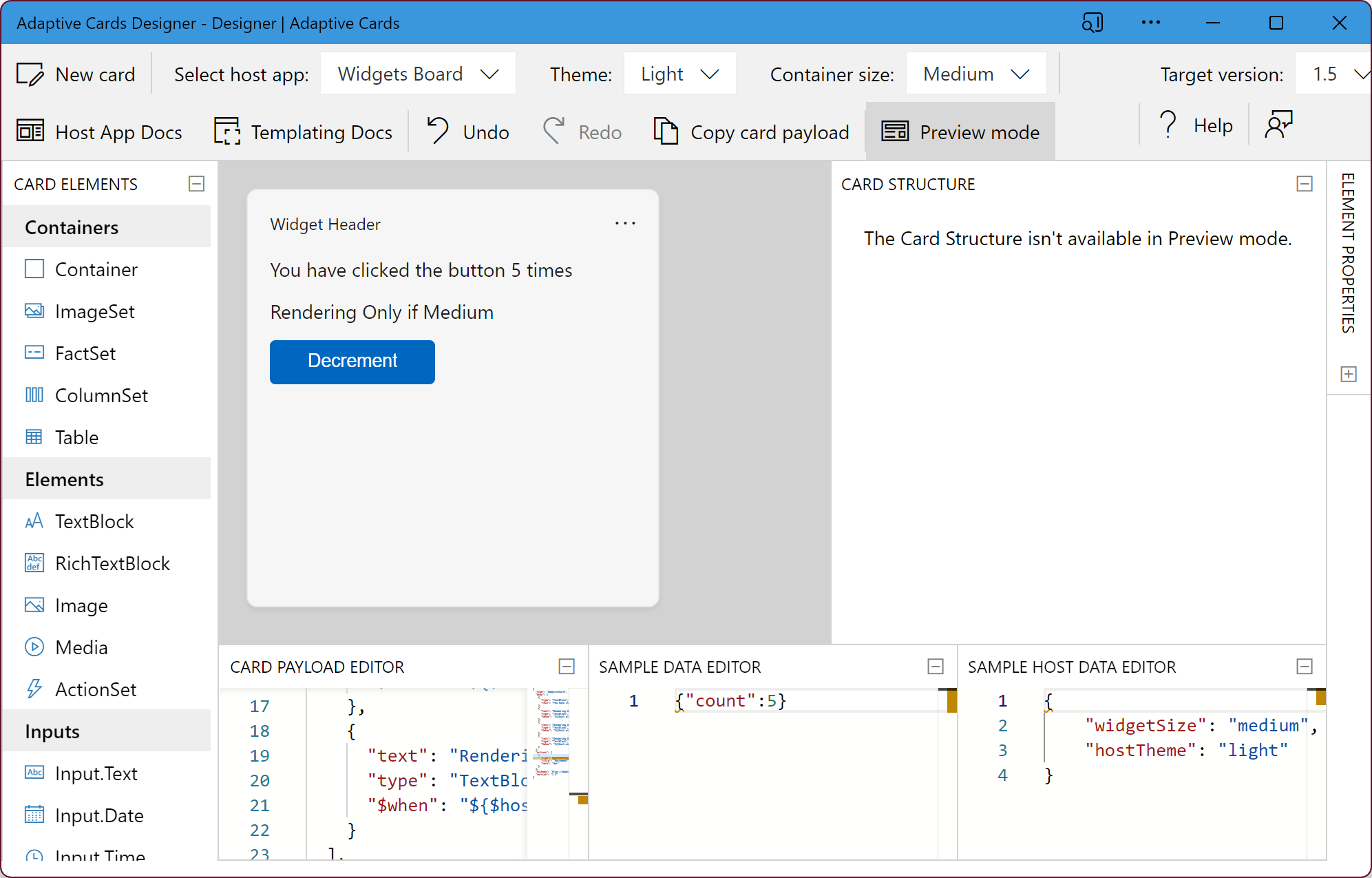
If you click the Preview mode button you can see how the widget will look when all the conditional expressions are evaluated.
Summary
Once you’ve finished designing your widget, you can either copy the contents of the Card Payload Editor or you can click the Copy card payload button. The contents can then be saved to a json file that’s deployed with your widget application, or alternatively you can serve this json from an api that can dynamically control how your widget renders.
There’s a full walk through of creating the counter layout widget in the Widgets documentation here. It’s also worth reading the other documentation pages on design, states and interaction with a widget.