As Windows, continues to apply the Fluent design language across various aspects of the underlying operating system, Microsoft is also looking to apply it to other first party applications. According to this post on their blog, Visual Studio is the next application to be hit by designers and not everyone is happy (check out comments on the Developer Community Ticket for some very mixed reactions). Personally I also have some mixed feelings, which I’ll try to expand on in this post.
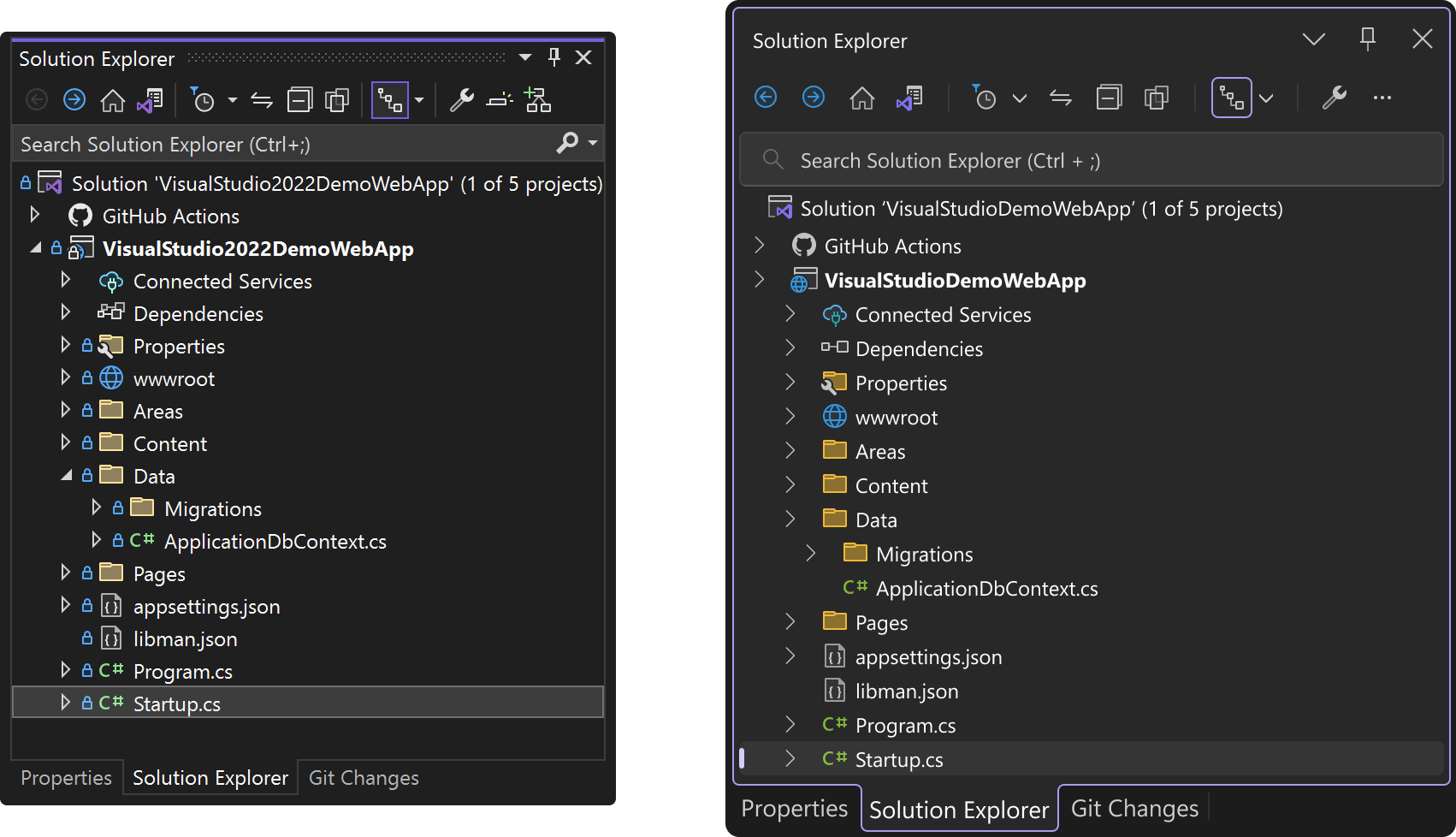
Ok, so let’s start with the elephant in the room – the blog post is awful at communicating the improvements and draws attention to the fact that everything is bigger and has more space, meaning you get to fit less in. This isn’t helped by the fact that in every example they give, the “new” look is shown in a screenshot that is larger than the “old” with basically the same set of items showing. Not Good! And if you just look at the pictures you wouldn’t be mistaken in thinking, “what a waste of time” and “don’t eat my screen real estate”. For example, take the following screenshot taken from the blog where it contrasts the new and old toolbars.

Both images show the same icon buttons, yet the proposed toolbar is significantly bigger than the existing toolbar. This is not something I want.
Now to put this in a bit of context the post itself talks about balancing the need for developers to maximise editor space versus the need to increase target size and reduce confusion. I do agree from an accessibility perspective, Visual Studio is probably quite hard to use in it’s current form for people who have a visual impairment or don’t have fine precision control with the mouse. Rather than increasing the size and spacing for the majority, wouldn’t it make sense to have an accessibility mode, or perhaps just a different theme, that developers could opt in/out of.
At the beginning of the post I indicated I had mixed feelings about the UI updates…. I’ll be honest, I think this smells of applying Fluent/WinUI in order to justify the existence of Fluent, rather than actually improving the productivity of the majority of developers.
Will the UI updates make Visual Studio look better, probably! Will it make me more productive? I’m not sure but what I do know is that it will eat further into my editor space. Perhaps the answer is to start using the new debugging support that the Uno Platform now offers in Visual Studio Code.

Hm, ok, but what do you think about the following design?
https://developercommunity.visualstudio.com/t/Update-UI-of-Visual-Studio-2022-like-the/1486609?stateGroup=active