In a previous post I covered using Figma to design and develop applications for Windows and the Uno Platform. This was a high level post that didn’t get into either Figma files (Fluent and Material) in much detail. One thing that is common to both files is the use of components, and component variants, to not only describe different UI controls but also their visual states. In this post we’re going to look at the Windows UI 3 Figma file and how it describes controls that you’d typically use when building a Windows (or Uno Platform) application in XAML (or C# Markup). This won’t be a full guide to the Figma file, so I would encourage you to read through the documentation contained in the file, specifically the Templates & Tasks, and Guidance & Charts pages.
Button Component
We’re going to jump to the Basic Input page and look at the Button component. At the top of the Button section of the page, there’s a brief description of the element, followed by a “Copy me” section.

If you want to make use of a control in your design, you can select the element from the “Copy me” section and use copy and paste to create a new instance on your design. Alternatively, you can find the control in the Assets window. From the Assets window, you can drag the control directly onto your design. Alternatively, if you click on the control, you’ll be presented with the list of Properties you can select before clicking the Insert Instance button.

Each of the Properties correlates to a variant of the component and can either be selected prior to inserting an instance, or afterwards via the element properties window.

Button Variants
Let’s return to the Basic input page and take a look at the next section, Variants. This section defines the different overall layouts for the Button
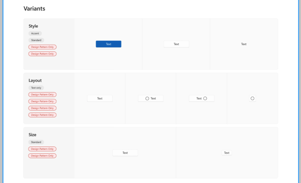
Style: The Style property determines the overall Button style such as Accent, Standard (ie Default) or Subtle
Layout: The different Layout options include Text only, Icon, Icon before and after text
Size: The Size options are Standard and Compact
Note that there are a number of “Design Preview Only” badges that have been applied under the variant title. These badges indicate that there are variant options that are not included in the standard fluent styles that ship with Windows UI.
Main Components
The next section, Main Components, provides a visual guide to some of the different combinations of variants of the Button.

Going down the page are the variants that relate to the layout of the Button such as Style, Layout and Size. Again, there are some variants that are marked as Design Preview Only, so these don’t correlate to actual styles that ship with Windows UI.
Each variant is shown in dark and light mode to illustrate how the Button would look in dark and light theme respectively.
Across the page are the variants that relate to the states of the Button. These are represented by two properties, Focus and State. The State property has values Rest, Hover, Pressed and Disabled. The Focus property is a boolean value.
Variants in XAML
Now that we have a bit of an understanding how components and variants are defined in Figma for the Button control, let’s look at how this relates to the way the Button control is defined in XAML. The built-in/default styles for controls that are part of Windows UI / Windows App Sdk are included in the generic.xaml file included int Microsoft.WindowsAppSdk nuget package (eg c:\Users\[User]\.nuget\packages\microsoft.windowsappsdk\1.5.240627000\lib\net6.0-windows10.0.18362.0\Microsoft.WinUI\Themes\generic.xaml).
The Style variant property correlates to the different Button styles, AccentButtonStyle (Accent) and DefaultButtonStyle (Normal). The Subtle variant included in the Figma file is marked as Design Preview Only as it doesn’t exist in the styles that ship with the Windows App Sdk.
If we take a look at the DefaultButtonStyle, which is also the implicit, or default, style for a Button, we can see that there are different visual states that map to the variants defined by the State property: Normal (Rest), PointerOver (Hover), Pressed and Disabled.

The last variant property is Focus. This isn’t represented by visual states since Windows UI controls have an option to UseSystemFocusVisuals (see documentation for how system focus visuals work)
In this post we’ve seen that the Windows UI Figma file defines the visual styles of the controls that ship with Windows UI and the Windows App Sdk. We’ve seen that the component variants aligns to styles and visual states for XAML controls, and that there some variants that are only defined in the Figma file.
2 thoughts on “How Figma Component Variants map to XAML Visual States in Windows UI”