I was discussing the features of the Uno Platform today and realised that we sometimes gloss over all the features. In this post we’re going to do a walk through of some of the different controls, styles and themes available to Windows (WinUI/Windows App SDK) and Uno Platform developers.
Gallery
One of the best ways to see the range of controls available is to check out the Gallery application that’s available on the web, iOS and Android.
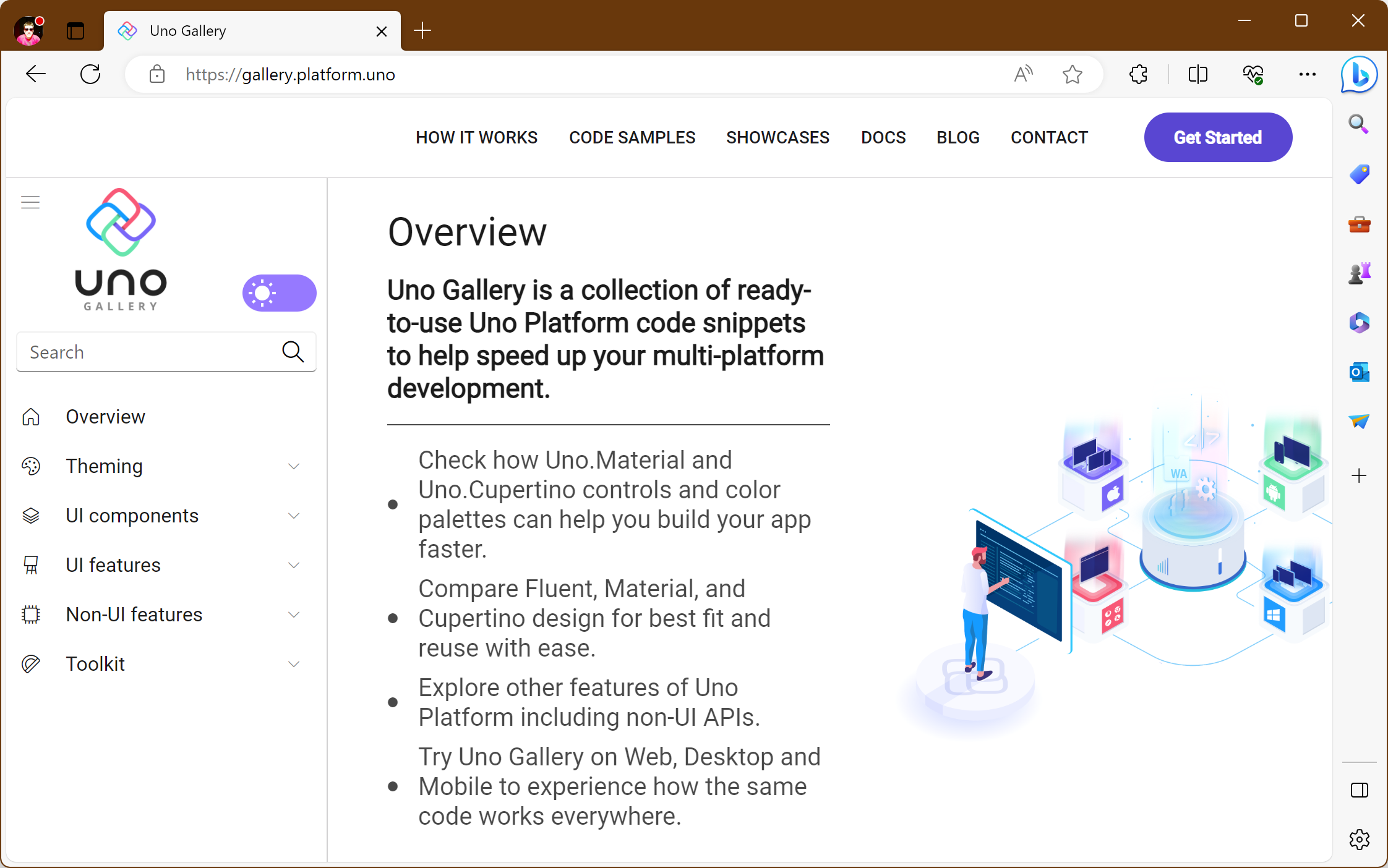
The Gallery is a collection of ready-to-use Fluent and Material code snippets that can help speed up your multi-platform development. You can visit the Uno Platform Gallery website at https://gallery.platform.uno.
Standard Controls
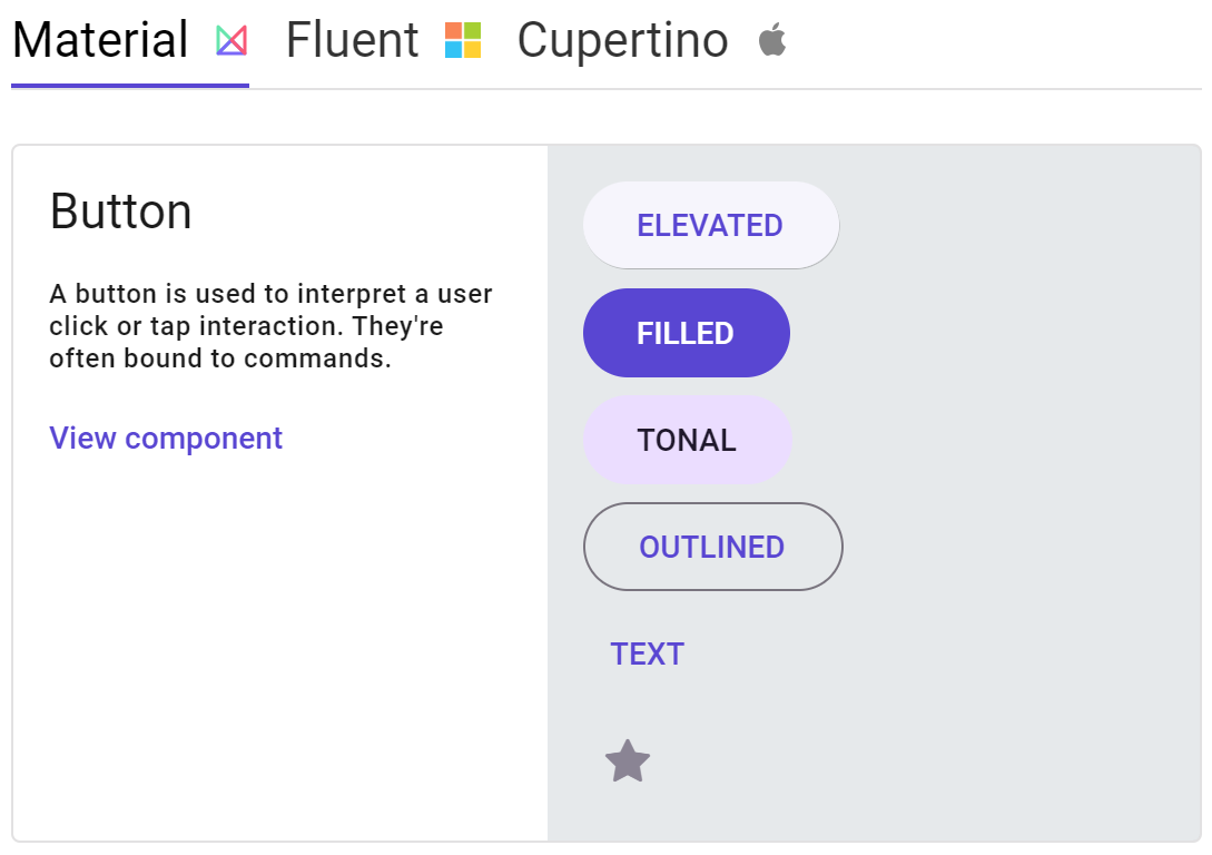
The UI Components section of the Gallery can be used to visualize the standard controls available to Uno Platform applications. Some controls, like the Button, have a number of built-in styles that can be applied.
Theming
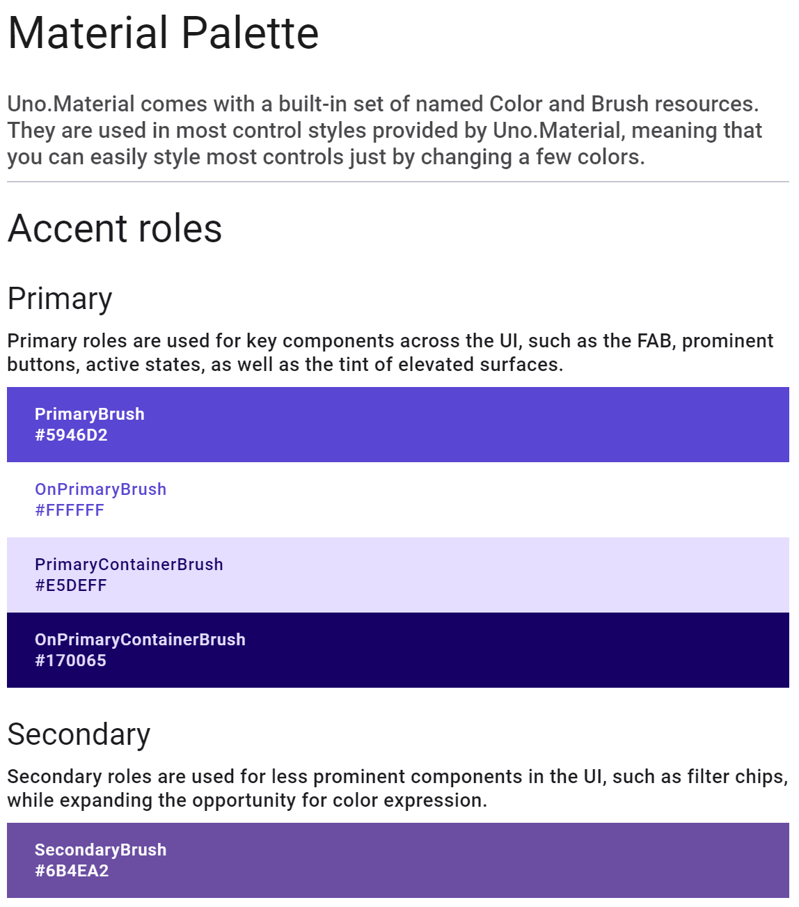
In the Theming section of the Gallery you can explore the different theme palettes for Material, Fluent and Cupertino. The section also covers lightweight styling and typography options.
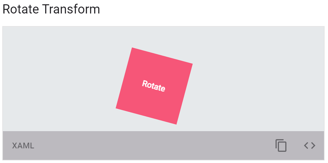
Backgrounds, Animations and Transforms
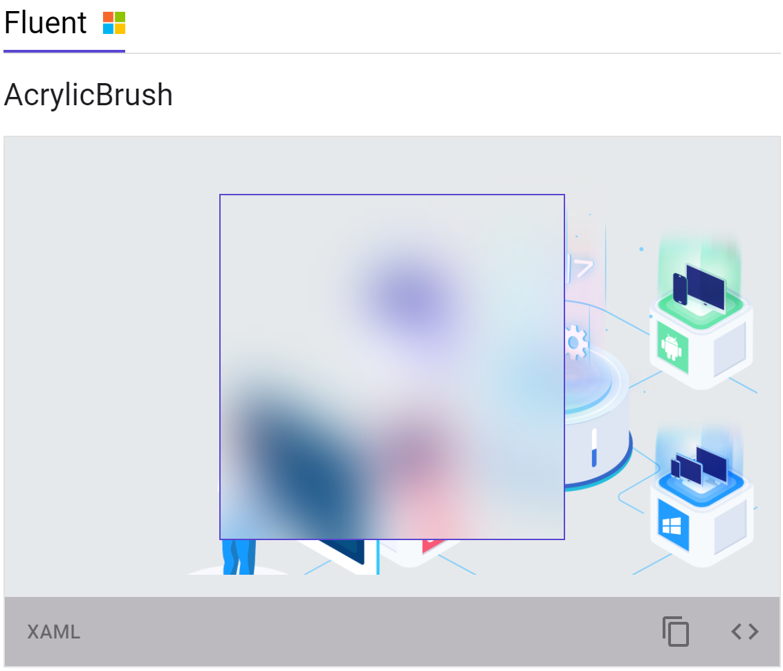
The Gallery also provides an interactive way to get familiar with options for setting backgrounds such as using Acrylic on Windows, and using animations and transforms within an Uno Platform application.
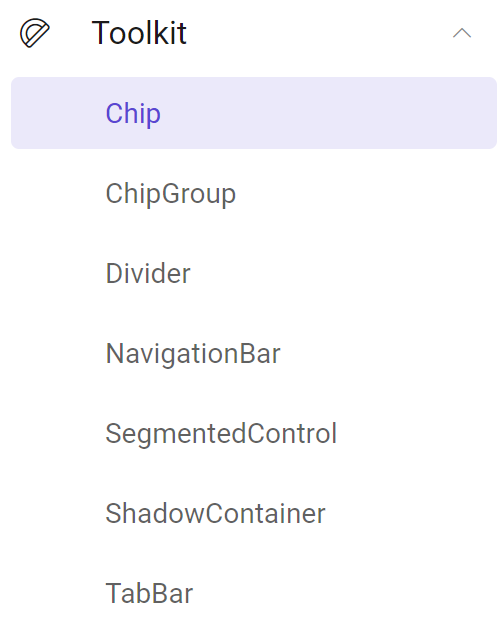
Toolkit
The final section of the Gallery showcases the controls in the Uno Toolkit
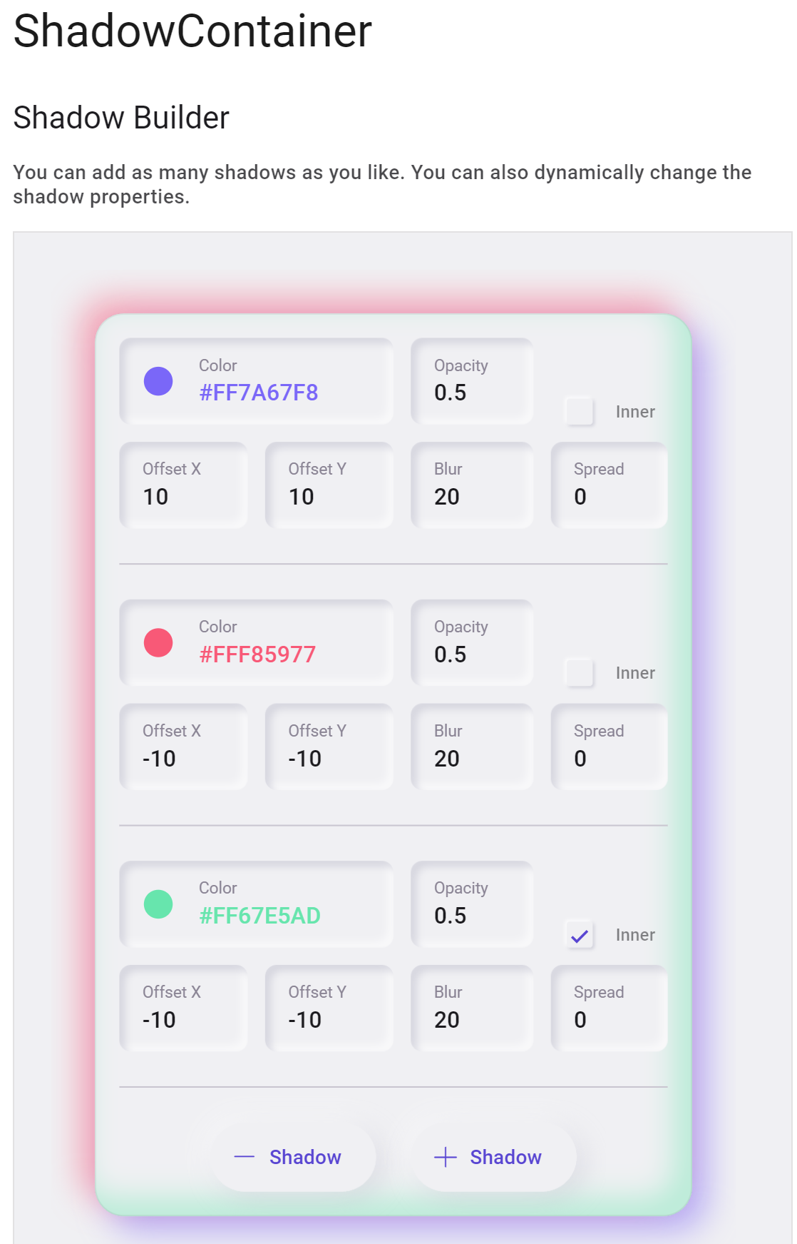
One of the recent additions is the ShadowContainer – use the ShadowBuilder to see an interactive example of applying one or more shadows.
Windows Community Toolkit
In addition to the built-in controls, styles and toolkit of the Uno Platform, applications can also leverage third party libraries. The Windows Community Toolkit has recently been updated to include ship support for both Windows and the other targets of the Uno Platform (previously the toolkit was released for Windows by Microsoft and for other targets by the Uno team).
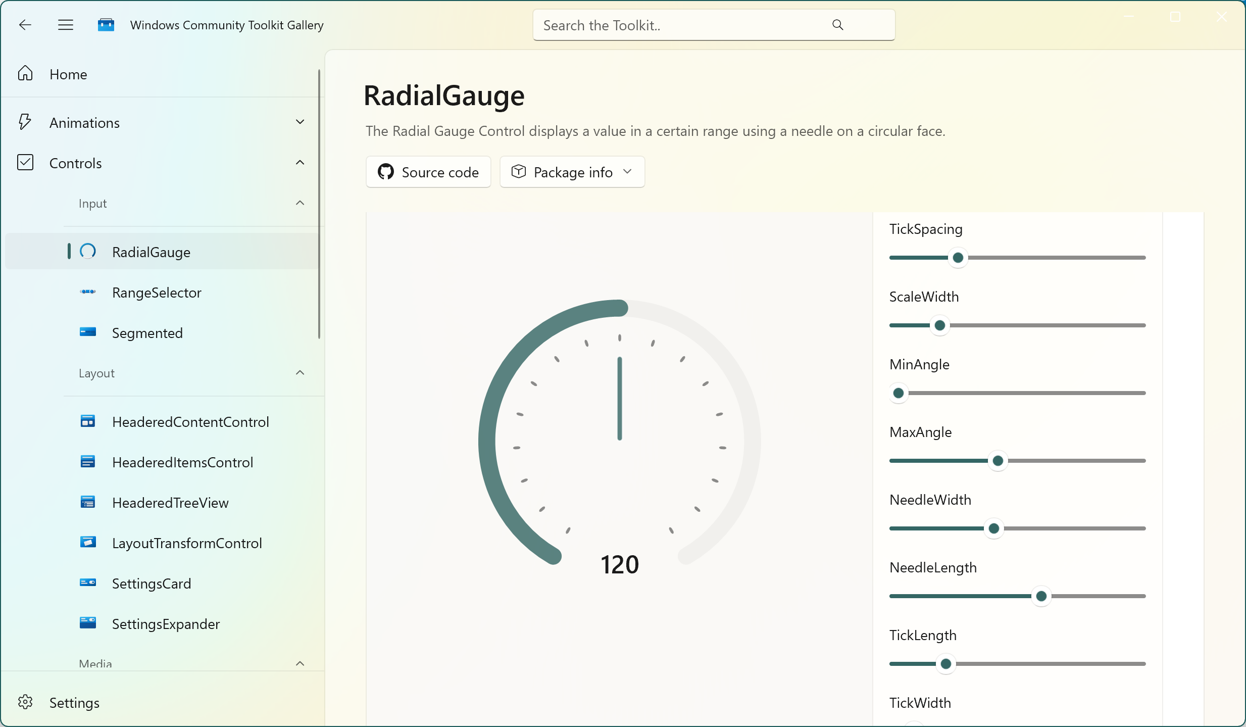
Check out the Windows Community Toolkit Gallery application for an interactive way to browse the controls and access sample code that you can use in your application.
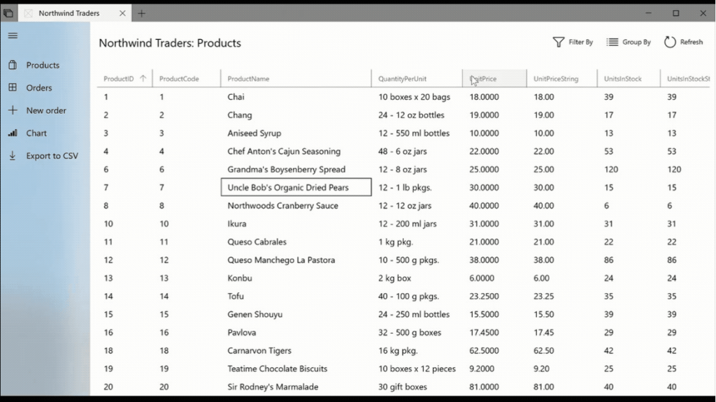
The Community Toolkit also has a DataGrid that can be used to present tabular data. More information can be found in the documentation.
Mapsui
For applications that want to show mapping data, Mapsui supports the Uno Platform targets.
Check out the documentation for more information on Mapsui
LiveCharts
LiveCharts provides charts, maps and gauges for Uno Platform applications.
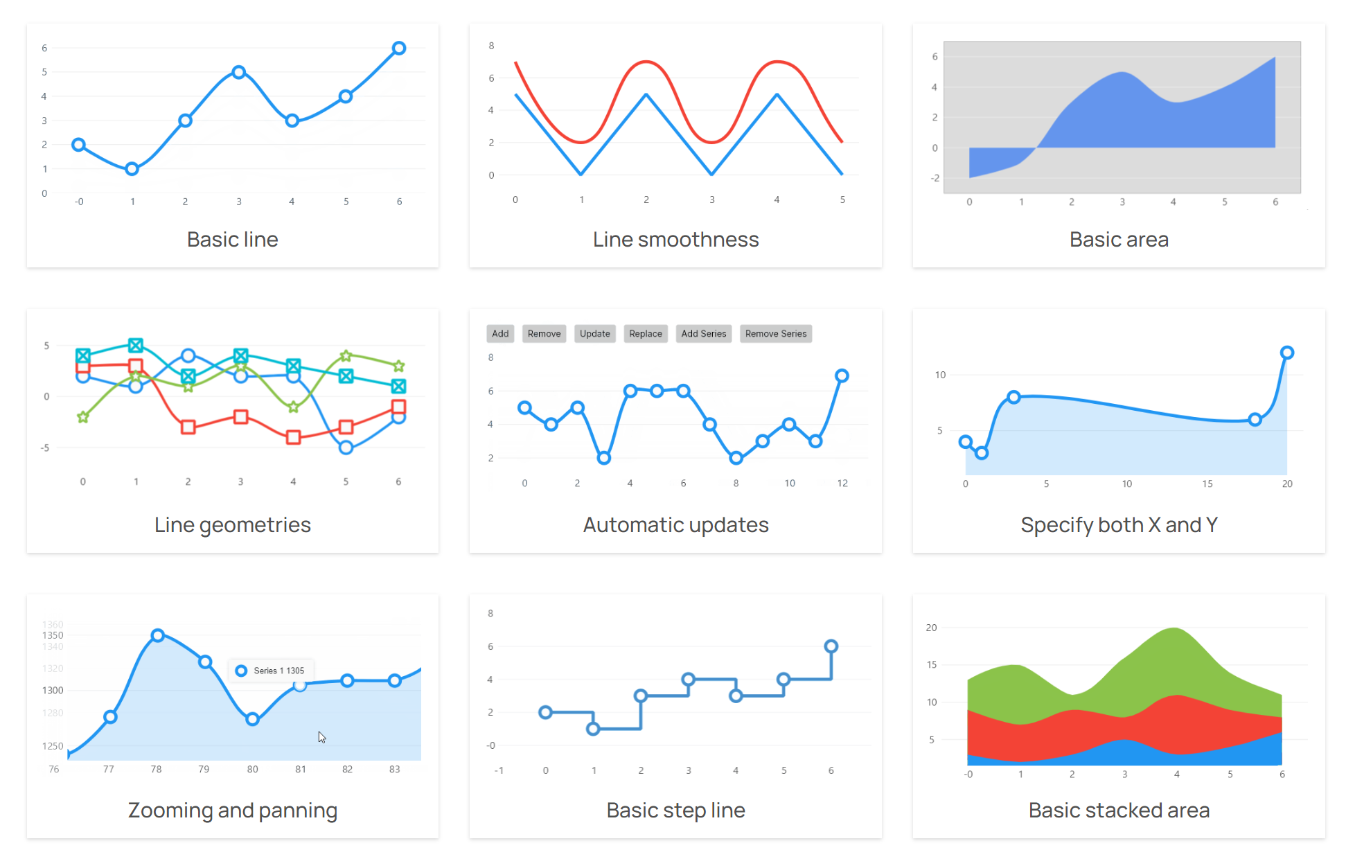
Check out the LiveCharts website for more information.
.NET MAUI Embedding
The Uno Platform supports embedding .NET MAUI controls. This opens up opportunities to include controls from third party components, such as the following:
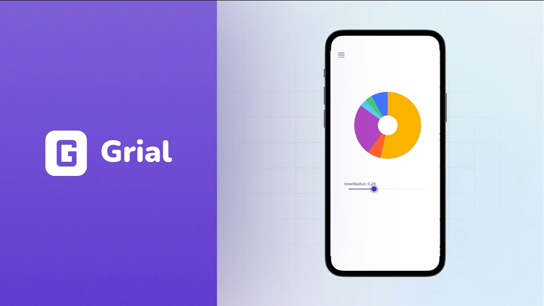
GrialKit
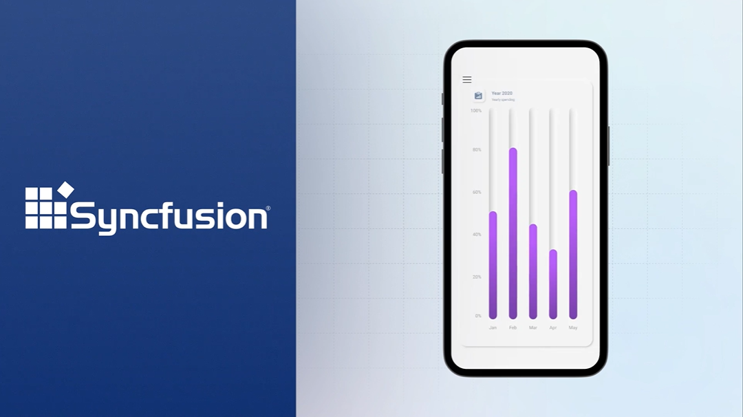
Syncfusion
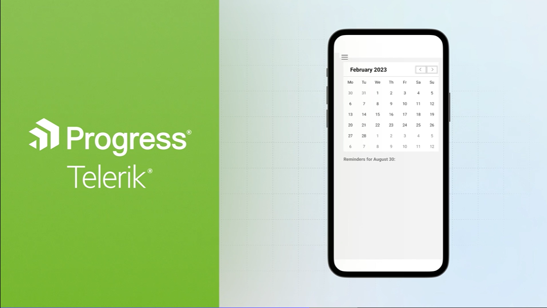
Progress Telerik
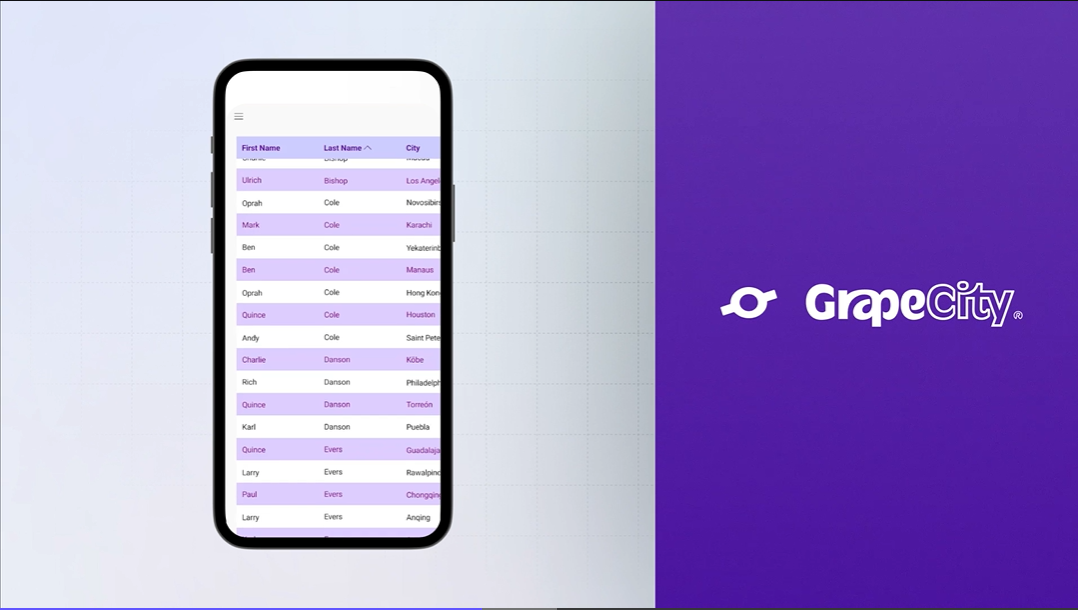
GrapeCity
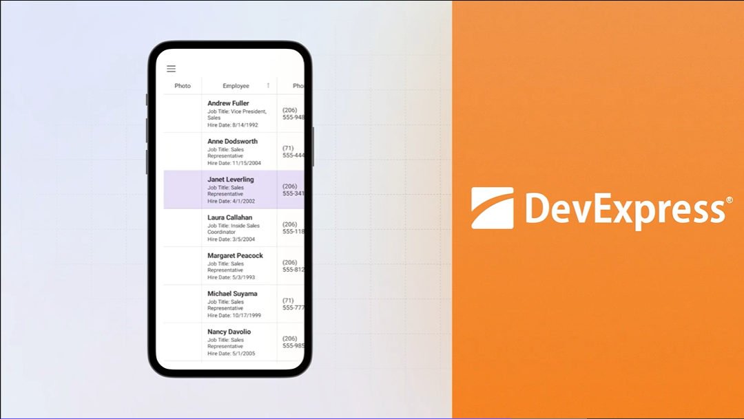
DevExpress
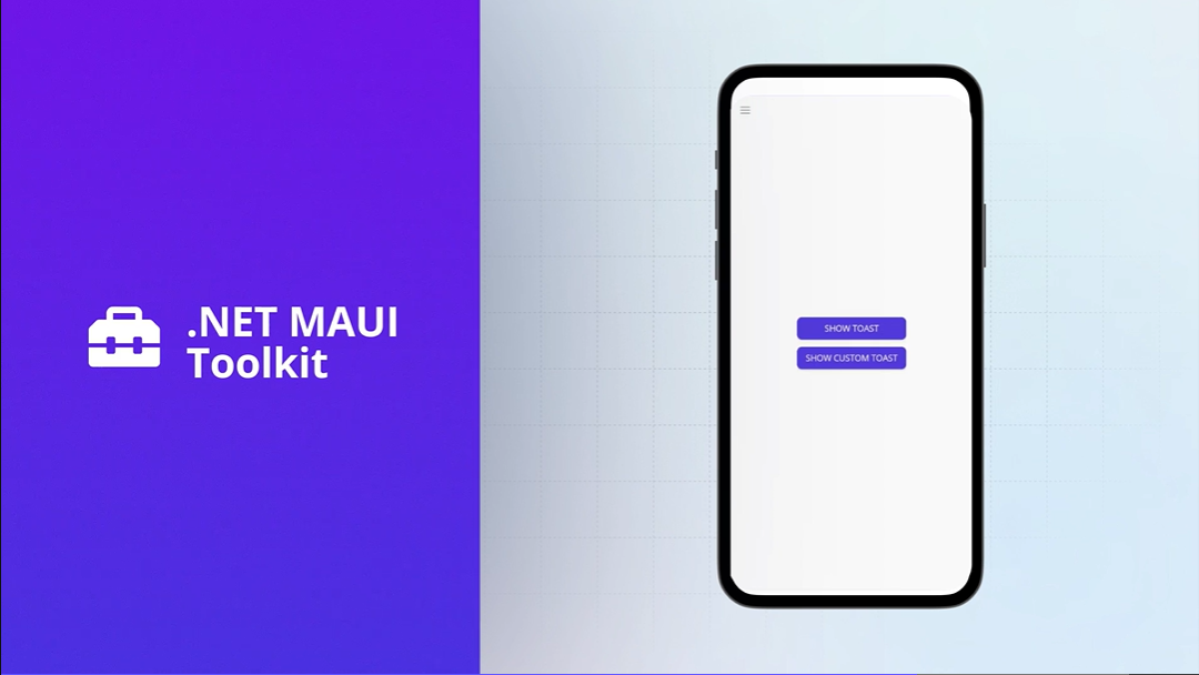
.NET MAUI Toolkit
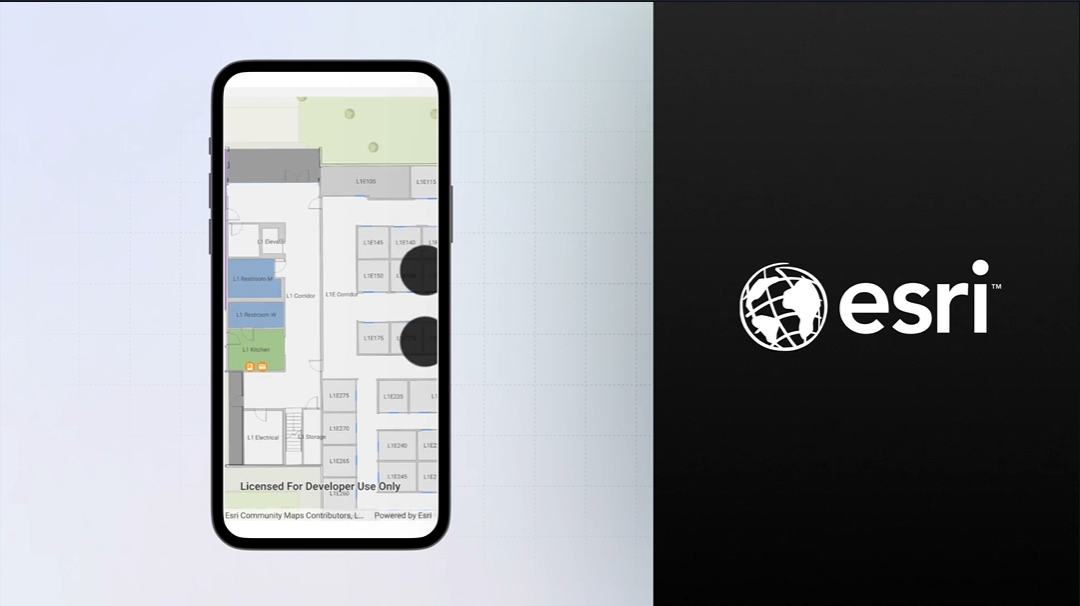
Esri
Summary
In this post we’ve seen both the built-in components and third party controls. With support for .NET MAUI controls via embedding, there’s now even more controls available to use in an Uno Platform application.
2 thoughts on “Controls for WinUI and the Uno Platform”