One of the questions that came up recently was how to make what appears to be a simple change to a Button – change the background colour of the Button to Red when it’s disabled. You’d think this would be simply a matter of changing a property on the Button but for most flavours of XAML (UWP, WinUI, Uno Platform) this is not the case. In this post we’re going to look at the options for achieving this, along with some general styling guidelines for XAML.
To kick things off, let’s recap on how controls are styled in XAML, and specifically why there isn’t a DisabledColor property exposed on the Button control. XAML controls adhere to the concept of lookless controls, which essentially means that the behaviour is independent of its styling. In the case of a Button, the behaviour is that when a user clicks or taps on the control, it raises an event (or triggers a Command).
The properties that a control expose tend to cover a mix of adjusting behavior (eg Disabled) and style (eg Foreground) but they typically represent aspects of the control that most developers would want to use, irrespective of the underlying style of the control. Adding a DisabledColor property would assume that the style changes the color of the control when it is disabled – this isn’t necessarily the case as an alternative design might change the opacity of the control. Instead of adding a DisabledColor, the guidance to developers is that they can override the default style of the control.
The style of the Button is something that you have complete control over but rather than every app having to start from scratch, there are built in ControlTemplates that are based on Fluent design (you can find the full set of XAML styles via my post, Colors, Styles and Templates in UWP, Windows UI (WinUI) and the Windows App Sdk (WinAppSdk)).
As a quick aside – The team at Uno Platform who have been working on both Material and Cupertino theme packages – even if you’re not using Uno, if you’re building for Windows and want to use either Material or Cupertino, you can grab the theme packages and use them!
Let’s take a look at the ControlTemplate for the Button that ships with Windows UI by cracking open the generic.xaml file. You can find the Button styles by searching for TargetType="Button" and specifically we’re looking for the implicit style (the one that doesn’t have an x:Key attribute defined). The implicit style is the default Button style and will be applied in absence of any specific Style set on a Button element.
<!-- Default style for Windows.UI.Xaml.Controls.Button -->
<Style TargetType="Button" BasedOn="{StaticResource DefaultButtonStyle}" />
As we can see, the default Button style is actually an empty style that is BasedOn the DefaultButtonStyle. This is considered best practice when defining implicit styles – you first define an explicit style (in this case DefaultButtonStyle) and then define an implicit style that inherits from, or is BasedOn, the explicit style. I would encourage you to follow this practice in your own apps if you’re defining any implicit styles. The benefit of this extra step is that if you want to create a Style that derives from the implicit style, you can; you just need to reference the explicit Style that the implicit Style is BasedOn.
The next thing to do is to take a look at the DefaultButtonStyle. As you can see from the following XAML, the DefaultButtonStyle sets default values for a number of properties on the Button control, including setting the Template property to be a ContentTemplate defined in XAML.
<Style x:Key="DefaultButtonStyle" TargetType="Button">
    <Setter Property="Background" Value="{ThemeResource ButtonBackground}" />
    <Setter Property="BackgroundSizing" Value="InnerBorderEdge" />
    <Setter Property="Foreground" Value="{ThemeResource ButtonForeground}" />
    <Setter Property="BorderBrush" Value="{ThemeResource ButtonBorderBrush}" />
    <Setter Property="BorderThickness" Value="{ThemeResource ButtonBorderThemeThickness}" />
    <Setter Property="Padding" Value="{StaticResource ButtonPadding}" />
    <Setter Property="HorizontalAlignment" Value="Left" />
    <Setter Property="VerticalAlignment" Value="Center" />
    <Setter Property="FontFamily" Value="{ThemeResource ContentControlThemeFontFamily}" />
    <Setter Property="FontWeight" Value="Normal" />
    <Setter Property="FontSize" Value="{ThemeResource ControlContentThemeFontSize}" />
    <Setter Property="UseSystemFocusVisuals" Value="{StaticResource UseSystemFocusVisuals}" />
    <Setter Property="FocusVisualMargin" Value="-3" />
    <Setter Property="CornerRadius" Value="{ThemeResource ControlCornerRadius}" />
    <Setter Property="Template">
        <Setter.Value>
            <ControlTemplate TargetType="Button">
                <ContentPresenter x:Name="ContentPresenter" Background="{TemplateBinding Background}" BackgroundSizing="{TemplateBinding BackgroundSizing}" BorderBrush="{TemplateBinding BorderBrush}" BorderThickness="{TemplateBinding BorderThickness}" Content="{TemplateBinding Content}" ContentTemplate="{TemplateBinding ContentTemplate}" ContentTransitions="{TemplateBinding ContentTransitions}" CornerRadius="{TemplateBinding CornerRadius}" Padding="{TemplateBinding Padding}" HorizontalContentAlignment="{TemplateBinding HorizontalContentAlignment}" VerticalContentAlignment="{TemplateBinding VerticalContentAlignment}" AutomationProperties.AccessibilityView="Raw" local:AnimatedIcon.State="Normal" xmlns:local="using:Microsoft.UI.Xaml.Controls">
                    <ContentPresenter.BackgroundTransition>
                        <BrushTransition Duration="0:0:0.083" />
                    </ContentPresenter.BackgroundTransition>

                    <VisualStateManager.VisualStateGroups>
                        <VisualStateGroup x:Name="CommonStates">
                            <VisualState x:Name="Normal" />

                            <VisualState x:Name="PointerOver">

                                <Storyboard>
                                    <ObjectAnimationUsingKeyFrames Storyboard.TargetName="ContentPresenter" Storyboard.TargetProperty="Background">
                                        <DiscreteObjectKeyFrame KeyTime="0" Value="{ThemeResource ButtonBackgroundPointerOver}" />
                                    </ObjectAnimationUsingKeyFrames>
                                    <ObjectAnimationUsingKeyFrames Storyboard.TargetName="ContentPresenter" Storyboard.TargetProperty="BorderBrush">
                                        <DiscreteObjectKeyFrame KeyTime="0" Value="{ThemeResource ButtonBorderBrushPointerOver}" />
                                    </ObjectAnimationUsingKeyFrames>
                                    <ObjectAnimationUsingKeyFrames Storyboard.TargetName="ContentPresenter" Storyboard.TargetProperty="Foreground">
                                        <DiscreteObjectKeyFrame KeyTime="0" Value="{ThemeResource ButtonForegroundPointerOver}" />
                                    </ObjectAnimationUsingKeyFrames>
                                </Storyboard>
                                <VisualState.Setters>
                                    <Setter Target="ContentPresenter.(controls:AnimatedIcon.State)" Value="PointerOver" />

                                </VisualState.Setters>
                            </VisualState>

                            <VisualState x:Name="Pressed">

                                <Storyboard>
                                    <ObjectAnimationUsingKeyFrames Storyboard.TargetName="ContentPresenter" Storyboard.TargetProperty="Background">
                                        <DiscreteObjectKeyFrame KeyTime="0" Value="{ThemeResource ButtonBackgroundPressed}" />
                                    </ObjectAnimationUsingKeyFrames>
                                    <ObjectAnimationUsingKeyFrames Storyboard.TargetName="ContentPresenter" Storyboard.TargetProperty="BorderBrush">
                                        <DiscreteObjectKeyFrame KeyTime="0" Value="{ThemeResource ButtonBorderBrushPressed}" />
                                    </ObjectAnimationUsingKeyFrames>
                                    <ObjectAnimationUsingKeyFrames Storyboard.TargetName="ContentPresenter" Storyboard.TargetProperty="Foreground">
                                        <DiscreteObjectKeyFrame KeyTime="0" Value="{ThemeResource ButtonForegroundPressed}" />
                                    </ObjectAnimationUsingKeyFrames>
                                </Storyboard>
                                <VisualState.Setters>
                                    <Setter Target="ContentPresenter.(controls:AnimatedIcon.State)" Value="Pressed" />

                                </VisualState.Setters>
                            </VisualState>

                            <VisualState x:Name="Disabled">

                                <Storyboard>
                                    <ObjectAnimationUsingKeyFrames Storyboard.TargetName="ContentPresenter" Storyboard.TargetProperty="Background">
                                        <DiscreteObjectKeyFrame KeyTime="0" Value="{ThemeResource ButtonBackgroundDisabled}" />
                                    </ObjectAnimationUsingKeyFrames>
                                    <ObjectAnimationUsingKeyFrames Storyboard.TargetName="ContentPresenter" Storyboard.TargetProperty="BorderBrush">
                                        <DiscreteObjectKeyFrame KeyTime="0" Value="{ThemeResource ButtonBorderBrushDisabled}" />
                                    </ObjectAnimationUsingKeyFrames>
                                    <ObjectAnimationUsingKeyFrames Storyboard.TargetName="ContentPresenter" Storyboard.TargetProperty="Foreground">
                                        <DiscreteObjectKeyFrame KeyTime="0" Value="{ThemeResource ButtonForegroundDisabled}" />
                                    </ObjectAnimationUsingKeyFrames>
                                </Storyboard>
                                <VisualState.Setters>
                                    <!-- DisabledVisual Should be handled by the control, not the animated icon. -->
                                    <Setter Target="ContentPresenter.(controls:AnimatedIcon.State)" Value="Normal" />

                                </VisualState.Setters>
                            </VisualState>

                        </VisualStateGroup>

                    </VisualStateManager.VisualStateGroups>
                </ContentPresenter>

            </ControlTemplate>
        </Setter.Value>
    </Setter>
</Style>
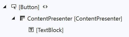
The template for the Button is very simple as it includes a single element, the ContentPresenter, which will, as the name suggests, present the Content of the Button. It’s worth doing a quick recap of how the Button control is used in XAML. Often we see simple Buttons being defined with the Content property just being set to a string.
<Button Content="My Button" Click="ButtonClicked" />
Or, alternatively:
<Button Click="ButtonClicked">My Button</Button>
Note: The second alternative works because the ContentPropertyAttribute is set on the Button with a value of Content – this means that whatever appears between the XML tags will be assigned to the Content property on the Button. Knowing about the ContentPropertyAttribute is useful if you’re ever creating your own custom control and want to tailor the way the XAML markup works.
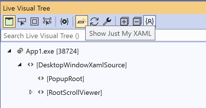
Often, developers new to XAML will ask why a TextBlock has a Text property but a Button has a Content property. This is because the Content property on the Button is able to accept any XAML that will be presented within the Button using a ContentPresenter (which you can see in the above ContentTemplate). For convenience, there’s a built in converter from a string to a TextBlock, which can be seen in the Live Visual Tree when running the application.
Note: If you don’t see the ContentPresenter and TextBlock in the Live Visual Tree when inspecting a Button, it’s probably because you have “Show Just My XAML” enabled in the Live Visual Tree toolbar. Toggle this toolbar button to either see just the XAML you’ve defined in your application, or the full visual tree.
If we return to the ContentTemplate for the Button, as we observed earlier, it’s only made up of one element, the ContentPresenter. The rest of the template is a bunch of visual states that define the change in Properties on the ContentPresenter for different states that the Button can be in.
<ContentPresenter x:Name="ContentPresenter"
                    Background="{TemplateBinding Background}"
                    BackgroundSizing="{TemplateBinding BackgroundSizing}"
                    BorderBrush="{TemplateBinding BorderBrush}"
                    BorderThickness="{TemplateBinding BorderThickness}"
                    Content="{TemplateBinding Content}"
                    ContentTemplate="{TemplateBinding ContentTemplate}"
                    ContentTransitions="{TemplateBinding ContentTransitions}"
                    CornerRadius="{TemplateBinding CornerRadius}"
                    Padding="{TemplateBinding Padding}"
                    HorizontalContentAlignment="{TemplateBinding HorizontalContentAlignment}"
                    VerticalContentAlignment="{TemplateBinding VerticalContentAlignment}"
                    AutomationProperties.AccessibilityView="Raw"
                    local:AnimatedIcon.State="Normal"
                    xmlns:local="using:Microsoft.UI.Xaml.Controls">
To change the Background to Red when the Button is disabled, we just need to change the Background property on the ContentPresenter when the Button is in the Disabled state. From the DefaultButtonStyle we can locate the Disabled VisualState and change the colour that is being applied for the Background property, as in this XAML.
<VisualState x:Name="Disabled">
    <Storyboard>
        <ObjectAnimationUsingKeyFrames Storyboard.TargetName="ContentPresenter" Storyboard.TargetProperty="Background">
            <DiscreteObjectKeyFrame KeyTime="0" Value="Red" />
        </ObjectAnimationUsingKeyFrames>
        <ObjectAnimationUsingKeyFrames Storyboard.TargetName="ContentPresenter" Storyboard.TargetProperty="BorderBrush">
            <DiscreteObjectKeyFrame KeyTime="0" Value="{ThemeResource ButtonBorderBrushDisabled}" />
        </ObjectAnimationUsingKeyFrames>
        <ObjectAnimationUsingKeyFrames Storyboard.TargetName="ContentPresenter" Storyboard.TargetProperty="Foreground">
            <DiscreteObjectKeyFrame KeyTime="0" Value="{ThemeResource ButtonForegroundDisabled}" />
        </ObjectAnimationUsingKeyFrames>
    </Storyboard>
    <VisualState.Setters>
        <Setter Target="ContentPresenter.(controls:AnimatedIcon.State)" Value="Normal" />
    </VisualState.Setters>
</VisualState>
Whilst this way works, it does mean you have to copy the entire DefaultButtonStyle into your application, so that you can apply this change. I would recommend giving the Style a different name and then creating a new implicit style that references it, so that your new Button Style gets applied to all buttons in your application.
What you might have noticed when we were changing the colour of the Background in the Disabled VisualState is that there was already a colour defined for the Background in the Disabled state, which was the “ButtonBackgroundDisabled” brush. We can locate this in the generic.xaml
<StaticResource x:Key="ButtonBackgroundDisabled" ResourceKey="ControlFillColorDisabledBrush" />
Notice how the ButtonBackgroundDisabled resource is actually a reference to the ControlFillColorDisabledBrush.
<SolidColorBrush x:Key="ControlFillColorDisabledBrush" Color="{StaticResource ControlFillColorDisabled}" />
The ColntrolFillColorDisabledBrush is a SolidColorBrush with a Color defined by the resource ControlFillColorDisabled
<Color x:Key="ControlFillColorDisabled">#FF0000</Color>
In your application you can adjust the disabled colour on the Button by defining the ButtonBackgroundDisabled, ControlFillColorDisabledBrush or the ControlFillColorDisabled color.
ButtonBackgroundDisabled – This should be a Brush (typically a SolidColorBrush) and is specifically for changing the disabled background color only on Button controls.
ControlFillColorDisabledBrush – This should also be a Brush and will change the fill color (typically the Background) all controls that are disabled.
ContorlFillColorDisabled – This is a Color and like the ControlFillColorDisabledBrush will change the fill color for all controls that are disabled.
It’s up to you as to which of these resources you override in your application in order to change the Background of the Button controls in your application in the disabled state.
2 thoughts on “Understanding Styles in XAML based Applications”
Comments are closed.